How to Build a Quarterly Business Review (QBR) That Earns Trust
A field guide for marketing, sales, and customer success leaders who inherit QBR production whether they want to or not.
Most QBRs are built in a panic.
Someone adds "Q3 QBR prep" to the calendar three weeks out. A spreadsheet starts circulating. The sales team pulls numbers from one dashboard, finance from another, customer success from a third. A deck template gets forwarded from last quarter. By the day before the meeting, the deck is 47 slides long, has three fonts, and nobody has read the whole thing including the person presenting it.
The meeting itself goes one of two ways. Either it becomes a defensive data dump where the presenters race through metrics without context and finish with no decisions made. Or it becomes a thinly-veiled sales motion where the deck exists primarily to justify what the team wants to do next quarter, not reflect on what actually happened.
Neither version is a quarterly business review. Both waste the thing a QBR is actually for: a structured moment, four times a year, where leaders and operators look at the same data, agree on what changed, and decide what to do differently.
This guide covers how to build a QBR deck that actually earns the trust it is meant to signal. The structure, the data decisions, the design choices, and the operating cadence that make the quarterly review feel strategic rather than theatrical. It is written for marketing leaders, chiefs of staff, heads of customer success, and the operators who inherit QBR production whether they want to or not.
The two failure modes most QBRs fall into
The data dump QBR. Thirty slides of metrics, each with its own chart, no narrative connecting them. The presenter rushes through at two minutes per slide. The audience checks phones halfway through. Nobody remembers slide 14 by the time they get to slide 27. Decisions get deferred to "a follow-up conversation" that never happens.
The sales motion QBR. The deck's actual purpose is to secure budget for next quarter's plan. Current-quarter data gets cherry-picked to support the pitch. Problems get buried in appendices or omitted entirely. Executives nod along, feel like something was reviewed, and approve the ask. One quarter later, when the plan has not worked, nobody has an honest baseline to work from.
Both failures share a root cause: the deck was built to show, not to decide. In the first case, show every metric. In the second, show the metrics that support the pitch. Neither orientation treats the QBR as what it should be: a decision meeting.
The counterintuitive move most QBRs miss: the deck's structure should make it harder, not easier, to avoid honest conclusions. If after reviewing the deck nobody has to change anything they're doing next quarter, the deck failed at its job regardless of how beautifully produced it is.
What a QBR is actually for
Three audiences read a QBR deck differently.
The executive audience (CEO, board liaisons, department heads) wants to know what changed from last quarter and whether the direction set then is still right. They care less about the specific numbers and more about the pattern - did we hit our commits, where are we drifting, what does the team now believe is true that we did not believe three months ago.
The peer audience (other department leaders) wants to understand how your quarter affects their quarter. Did sales close more enterprise deals that will create product work? Did customer success lose accounts that will show up in next quarter revenue? Did marketing experiments produce learnings that should change how other teams target?
The operator audience (your own team) is reading the deck to understand how their work is being characterized. Mischaracterize their effort and you lose their trust for the next quarter.
The deck has to serve all three simultaneously. The structural answer is not more slides. It is cleaner structure that lets each audience find what they need without wading through what they do not.
A good QBR answers four questions in order:
- What did we commit to last quarter?
- What actually happened?
- What did we learn?
- What are we going to do differently?
That's the entire structure. Everything else is support.
Many QBRs fail by inverting the order - leading with the plan for next quarter, backing into the data retroactively. The audience reads this as "we already decided; this is the justification." Trust erodes immediately even if the data is clean.
The internal signal of a strategic QBR: by the time you reach slide 4 or 5, the executive audience should already know whether the quarter was a success or a problem, and the specific terms by which it was each. If they are still trying to figure that out at slide 15, the structure failed.
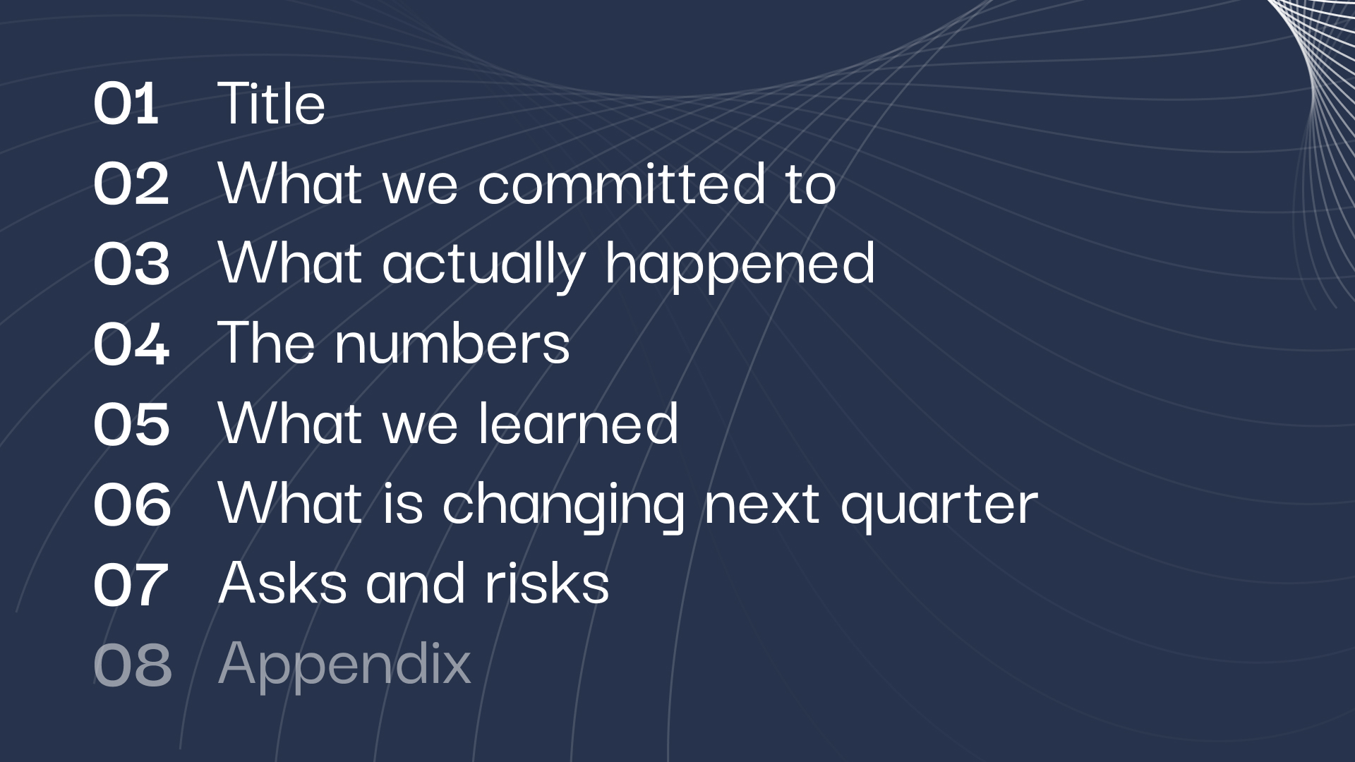
The 7-slide QBR deck structure
A tight QBR runs 7 content slides plus title and appendix. Longer than that and the audience loses the thread. Shorter and the detail is not there to support honest decisions.
- Slide 1 - TitleName the quarter and the owner. "Q3 2026 QBR - Marketing" is enough. Date, prep by, presented by.
- Slide 2 - What we committed toPull last quarter's QBR deck and show, exactly, what the commitments were. Three to five commitments maximum - a quarter cannot actually move more than that. State each in one line as it was written then, not retrospectively edited to look better.
- Slide 3 - What actually happenedFor each commitment from slide 2, state the outcome in one line: Hit, Missed, Changed Direction, Still In Flight. Color-code sparingly - this is the only slide where red/yellow/green works. Everywhere else it reads as defensive.
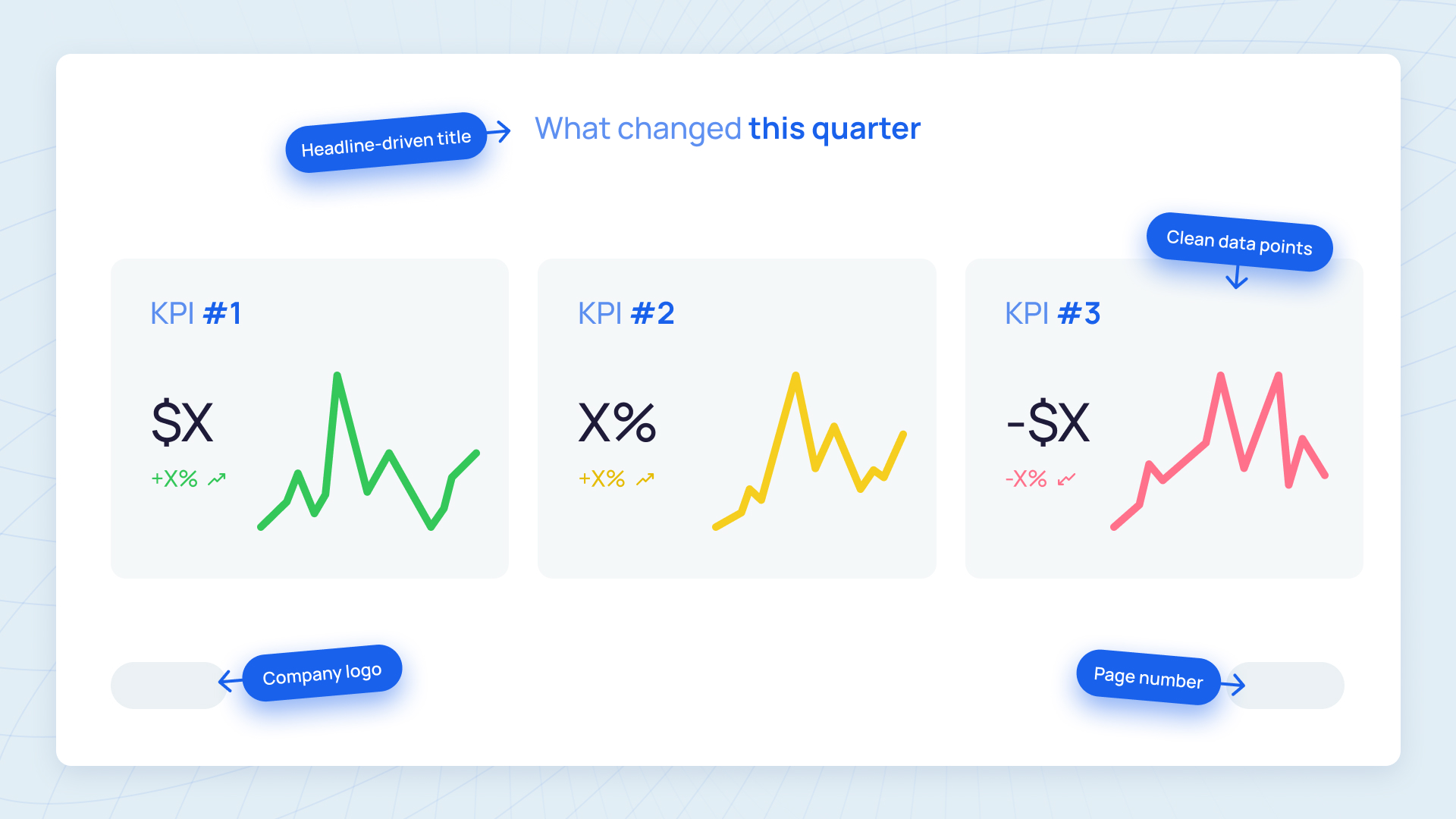
- Slide 4 - The numbersCore metrics for the quarter, one chart maximum. Pick the three to five metrics that matter most for your function. Marketing: pipeline sourced, pipeline velocity, cost per opportunity, retention of marketing-sourced accounts. Sales: new ARR, win rate, average deal size, sales cycle. CS: GRR, NRR, time-to-value, support SLAs. Do not show every metric. Show the ones that let the audience judge the quarter honestly in 30 seconds.
- Slide 5 - What we learnedThis is the most important slide. Three insights from the quarter that change what the team believes about the business. Each one in a sentence. Not "we tried X and it worked" but "we tried X and we now believe Y about the market." The quality of the learnings slide tells the executive audience whether the team is actually learning or going through motions.
- Slide 6 - What is changing next quarterDecisions that follow directly from the learnings. "Because we now believe Y, we are going to stop doing A and start doing B." Not a plan - a short list of specific changes. If next quarter looks identical to last quarter, that is either a signal of exceptional stability or (more often) a signal that the team did not learn anything.
- Slide 7 - Asks and risksWhat the team needs from executives this quarter (budget, headcount, cross-functional support) and what the team is worried about (specific risks that could derail next quarter plan). Named, not vague.
Appendix. Every chart, every table, every supporting detail someone might ask about. The appendix is where the data dump lives. The deck itself stays strategic.
How to choose which data to show
The data decisions determine whether the QBR reads as strategic or theatrical.
Three questions to ask of every chart:
- Does this metric change what the audience will decide?
- Does it change what the team will do next quarter?
- Would the quarter story feel incomplete without it?
If the answer to all three is no, the chart belongs in the appendix, not the deck.
Vanity metrics (website traffic, social followers, open rates) rarely survive these three questions. They feel like they matter but almost never change decisions. Keep them in the appendix for anyone who asks.
Volume metrics (deals touched, calls made, campaigns sent) feel like evidence of work but usually do not change what is done differently. Appendix.
Quality metrics (win rate, retention, time-to-value) and outcome metrics (ARR, pipeline conversion, NPS trend) usually do pass the three questions. These are the deck job.
For each chart that does make the deck, the chart has to make the point visible in two seconds. If the audience has to study the axes to understand what they are looking at, redraw it. Headline-driven chart titles help: "Q3 pipeline velocity dropped 18%" tells the story. "Pipeline Velocity Trend" does not.
Our guide to data visualization for board decks covers the specific chart choices that read as credible to executive audiences and the ones that signal immaturity. Most of the same principles apply here.
The internal QBR vs the customer QBR
Many customer success and account management teams run QBRs with their largest customers. The structure is different from the internal version and worth separating.
A customer QBR is a trust-renewal moment. The customer is deciding - consciously or not - whether they still want to be a customer. Everything about the deck has to answer two questions: Is this partnership delivering what we hoped? Are the next 90 days going to make it worth continuing?
Structurally the customer QBR has four parts:
- What outcomes they bought and whether they got them (last 90 days)
- What's working and what's not
- What the next 90 days look like
- Expansion opportunities, if credible
The failure mode specific to customer QBRs: pitching expansion before earning the right to pitch expansion. If section 1 shows the customer is not getting what they bought, section 4 expansion pitch reads as tone-deaf and corrodes trust.
Design decisions matter more here than in the internal version. The customer sees your brand across every slide and will subconsciously judge how much the vendor cares by how considered the artifact looks. A hastily-assembled QBR deck signals that the customer is not a priority, regardless of what the words on the slides say.
For sales and customer success teams running many customer QBRs per quarter, consistency across every deck becomes impossible to maintain in-house without a dedicated designer. The same problem a monthly design subscription like Slidecore is built to absorb - a persistent design system applied to every customer-facing deck, with 24-hour turnaround per deck.
For comparison on how a subscription compares to hiring in-house or working with freelancers for recurring work like this, see design subscription vs in-house designer and presentation agency vs freelancer vs subscription .
How to handle a bad quarter
Every function has quarters that miss commitments materially. The QBR is where that gets owned.
The temptation is to soften the data, lead with context before the miss, or bury the problem behind the plan to fix it. All of these are read correctly by executive audiences as spin, and spin corrodes trust faster than the miss itself does.
The strategic move on a bad quarter: state the miss plainly on slide 3 (the "what happened" slide), with the number, in the first line. Then spend slide 5 (the "what we learned" slide) on what the team now understands that changes how next quarter runs. The audience knows the quarter missed. What they are actually evaluating is whether the team sees why.
A clean format for the bad-quarter learnings slide: three sentences, each starting "we now believe." Specific, not generic. "We now believe the enterprise ICP we targeted this quarter has a longer sales cycle than our commission plan assumed" is a useful learning. "We now believe we need to focus on quality over quantity" is noise that signals the team does not actually understand what went wrong.
Executive trust after a bad quarter is built by the quality of the learnings, not the plan. A team that misses, understands why, and commits to specific changes gets more credit than a team that hit numbers by accident and cannot explain the mechanism.
The design decisions that signal strategic maturity
A QBR deck's design does one of two things to executive audiences: builds trust that the team is operating with care, or quietly erodes it.
The decisions that signal maturity:
- Each slide has one point, named in the slide title. "Pipeline velocity dropped in Q3" not "Q3 Pipeline Analysis."
- Charts are headline-driven. The title tells the story; the chart proves it.
- Typography is consistent. One font family, two sizes, used everywhere.
- Data color-coding is restrained. Red/yellow/green used only on the status slide.
- Appendix is clearly labeled. Executives know what is in the deck main flow vs what is reference.
The decisions that signal immaturity (even if the data is good):
- Three different chart styles across the deck
- Charts with gridlines, axes, and labels that aren't needed
- Walls of text where a sentence would do
- Bullet points nested three levels deep
- Multiple fonts, often two sans-serifs that almost match
- Red-text callouts to try to force attention to specific numbers
Executives in growth-stage companies read decks for a living. They notice design decisions subconsciously even when they are not thinking about design. A deck that looks considered reinforces that the thinking behind it was considered. A deck that looks hastily assembled suggests the thinking was too.
Our slide design principles guide covers the foundational craft decisions that make business decks read as credible. Most of the principles that make a board deck feel earned apply directly to QBRs.
Making QBRs a system, not a scramble
The three-weeks-of-chaos QBR pattern is not inevitable. Teams that run QBRs well have usually made three systemic choices.
- Choice 1: QBR prep starts in week 10 of the quarter, not week 13Week 10 means the deck is drafted while the quarter is still live and the team has time to actually learn from the data rather than scramble to interpret it.
- Choice 2: The deck is built against a template that does not changeSame seven-slide structure every quarter. Same metric choices every quarter (unless the business genuinely changed what matters). This takes the "what structure should we use" conversation off the table and lets the team focus on the content.
- Choice 3: Deck production is separated from deck strategyThe person who decides what goes on each slide should not also be the person laying out the slide, choosing fonts, formatting the charts, and polishing the design. That is two full-time jobs during QBR week and it is why so many QBRs are built in a panic.
The separation looks different for different companies. A chief of staff might own strategy with a designer executing. A VP of Marketing might own strategy with an outsourced design partner handling production. A head of CS might run QBRs for 15 enterprise customers each quarter and need a design subscription to make that volume possible without hiring in-house.
Whatever the specific setup, the principle holds: strategic clarity and design execution rarely come from the same brain under deadline pressure. See how we think about this split in the design subscription vs in-house designer comparison.
Build your next QBR deck with Slidecore
Slidecore builds QBR decks for growth-stage marketing, sales, and customer success teams on monthly subscription. One named senior designer per account, a persistent design system carrying brand consistency across every QBR you ship, and a 24-hour turnaround per deck. From $2,500 per month. See the pricing at slidecore.co/#pricing
Explore the comparison guides to see which design partner fits your recurring QBR workload.
Frequently asked questions
Seven content slides plus title and appendix is the right length for an internal QBR. Customer QBRs can run slightly longer (10-12 slides) if there is genuine expansion material in the discussion. Decks longer than 15 slides for a 60-minute meeting usually indicate the team has not decided what matters most.
Strategy ownership (what goes on each slide) belongs with the function head or chief of staff. Production (layout, design, chart formatting, polish) belongs with a designer, whether in-house, freelance, or subscription. Separating these makes QBR prep sustainable; combining them is why so many QBRs are built in a panic.
In-person QBRs are higher-trust and higher-focus. Video QBRs are more sustainable and let you include stakeholders who otherwise would not attend. Most growth-stage companies alternate - the quarter-end QBR with the board liaison happens in person; the department-level QBR happens on video. Either way, the deck is the same.
If the quarter was genuinely great and the plan for next quarter is identical to this one, say so plainly on slide 6 and spend more time on slide 5 (learnings) than usual. A quarter that hit every commitment should still produce learnings about what changed in the market or what the team understood more sharply. If it did not, the team may be hitting commitments without understanding why - which is a hidden risk worth naming.
Yes, 24-48 hours ahead. Executive audiences read better than they listen. Pre-reading means the meeting is for decisions, not for presentation. Reading in the room is a waste of everyone time.
Characterize work by outcomes, not individuals. "Enterprise outbound sent 1,200 messages and converted 3 opportunities" is a team-level fact. "John Smith outbound underperformed" is a management conversation, not a QBR slide. Keep QBRs focused on function-level patterns; handle individual performance in the appropriate venue.
Starting late. Most of the design problems in QBR decks are not design problems - they are time problems. A team that drafts the content in week 10 and does production in weeks 11-12 produces a dramatically better artifact than a team that does both in week 13. The second-biggest mistake is treating the deck as a presentation artifact when it is actually a decision artifact.

Founder, Slidecore
Giorgi founded Slidecore to give teams a senior design partner for decks. His teams have designed 500+ decks for 100+ companies across SaaS, AI, fintech, and healthcare.
Meet the founder →Want decks like this for your team?
A design studio on subscription for every deck, report and keynote you ship.