Executive Presentation Design: The Rules for Slides Execs Actually Read
Executives do not read decks. They pattern-match. The six rules of executive presentation design and how to build a design system that scales the craft across the executive team.
Executives do not read decks. They pattern-match. That single insight, once you internalize it, changes every design decision you make in an executive presentation.
The mid-level version of a slide has full sentences that reward reading. The executive version has a takeaway line at the top that rewards scanning. The mid-level version has a chart with a story you build up to. The executive version has a chart with the story labeled directly on it. The mid-level version reads like an analysis. The executive version reads like a decision brief.
Most presentation design advice, even the good stuff, focuses on making slides that look clean and professional. That is necessary but not sufficient. Executive presentation design is a specific craft with specific rules, and the rules come from understanding how executives actually consume slides in the four minutes they have between meetings.
This guide walks through what executive presentation design is, why executives pattern-match rather than read, the underlying structure that makes an executive presentation work, the six pattern-match design rules, how the design changes by audience (board vs C-suite vs industry keynote vs all-hands), the common mistakes that make exec decks fall flat, the design decisions that actually matter, and how to build a design system that scales the craft across the executive team.
Written for the CMO, Design Lead, Chief of Staff, or executive team member who owns the visual layer of the company's most important presentations.
What Is Executive Presentation Design?
Executive presentation design is the craft of building slides for audiences whose attention is expensive, whose time is limited, and whose decisions have real consequences. It is a subset of presentation design in the same way that copywriting for a landing page is a subset of copywriting: the underlying skill is shared, but the constraints and success criteria are different enough that the sub-discipline develops its own rules.
The audience for executive presentation design includes boards of directors, C-suite teams, investment committees, senior leadership offsites, industry keynote audiences, and all-hands town halls at scale. What unites them is not seniority alone but a specific cognitive posture: they arrive with limited attention, pre-existing context, and a decision or judgment they are trying to make. They are not there to learn. They are there to decide.
That posture is what generates every rule in this guide. It is why the design of an executive presentation is fundamentally different from a training deck, a product demo, or a mid-level status update, and why designers who move from those formats to exec presentations often struggle at first: the skills are related, but the game is different.
Why Executives Pattern-Match Rather Than Read
The single most important thing to understand about executive audiences is a cognitive reality: they do not read your slides. They pattern-match against slides they have seen before, the argument they were expecting when they walked in, and the recommendation they are being asked to accept or reject.
Pattern-matching is not laziness. It is what cognitive load looks like when you have to hold twelve simultaneous problems in working memory and a 45-minute presentation is one of them. An executive reading every word of every slide is an executive not doing their actual job. The good ones have adapted to scan for signals: the takeaway line, the trend direction, the recommended action, the key risk. When those signals are present, they engage. When those signals are missing, they either ask for the deck to be re-read out loud (bad for the presenter) or they check out and reserve judgment (worse).
The design implication is simple. Every slide has to answer three questions in the first three seconds of an executive glance: What is this slide about? What am I supposed to conclude from it? What does that mean for the decision on the table?
Slides that answer those questions in three seconds accelerate the pattern-match. Slides that hide the answer inside dense body copy force reading, and reading in a boardroom is a failure state. Every design rule that follows comes from this observation.
What Is the Pyramid Principle?
Barbara Minto, formerly of McKinsey, formalized the framework almost every effective executive presentation follows: the Pyramid Principle. Lead with the recommendation, support it with three to four supporting arguments, back each with evidence. In deck form, the structure looks like this.
1. The recommendation
One slide. Your recommendation, stated as a full sentence, in the slide title. Not "Q3 Strategic Update" but "Approve $2.4M investment to expand into three enterprise verticals in Q4." This is the pattern the executive is scanning for; put it on slide one.
2. The context
One or two slides. Why this decision is on the table now. What has changed since the last time this was discussed. What the executive needs to understand about the situation before they can weigh in.
3. The supporting arguments
Three to four sections, one per supporting argument. Each section is a mini-pyramid: one slide with the argument as a full-sentence takeaway, one or two slides with the evidence. This is where the analysis lives, but every slide still leads with its conclusion.
4. Risks and objections
One or two slides. The reasons a smart executive might disagree, named honestly, with a one-sentence response to each. Executives disengage from decks that pretend risks do not exist. They lean in on decks that name them clearly.
5. The recommendation, restated
One slide. Same recommendation as slide one, plus the specific decision, approval, or next step you are asking for. Not "questions?" — a specific ask.
6. Appendix
Everything the executive might want if they push on a specific number: detailed financial model, competitive analysis, technical architecture, hiring plan. Read by the executives who care about the specific area, ignored by the rest, and essential for both.
A well-built executive presentation runs 10 to 20 slides in the main body, with an appendix that can double that. Below 10 slides and the argument feels thin. Above 25 in the main body and the executive audience will disengage before the recommendation lands.
What Are the Six Rules of Pattern-Match Design?
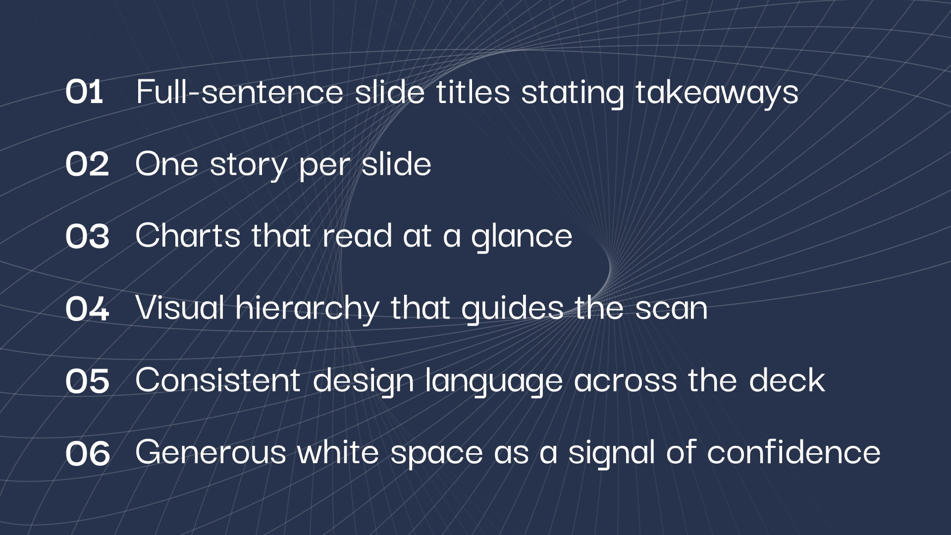
These are the design decisions that separate an executive presentation from a well-designed generic deck. Each rule maps to the pattern-matching cognitive reality above.
- 1Full-sentence slide titles that state the takeawayNot "Q3 Revenue" but "Q3 revenue exceeded plan by 12 percent, driven by enterprise segment." If an executive reads only the slide titles across the whole deck, they should get your argument in full. Every slide title is a mini-thesis statement. Fragment titles like "Q3 Revenue" or "Market Overview" force the executive to actually read the slide body to know what it says, which defeats the pattern-match.
- 2One story per slideIf a slide has two takeaways, split it into two slides. A slide with one clear takeaway is scannable in three seconds. A slide with two takeaways requires actual reading to figure out which one you are supposed to hold onto. Reading is the failure state.
- 3Charts that read at a glanceA chart on an executive slide has a single-sentence takeaway written above it. The takeaway comes first. The chart is evidence, not exposition. Executives should get the point of the chart from the takeaway line and only look at the chart itself to verify. If the takeaway line requires understanding the chart to make sense, the chart has failed as an executive design.
- 4Visual hierarchy that guides the scanThe eye should land in the same place on every slide first: the top-left, where the takeaway line lives. Then move down and right through the evidence. Slide layouts that vary from slide to slide, or that put the key information in different locations, break the pattern and force re-reading. Consistent placement is not a design constraint; it is a cognitive assist.
- 5Consistent design language across the deckSame fonts throughout. Same chart styles. Same color coding for status (green/amber/red used the same way on every slide). Same iconography if you use icons. Same footer format. An executive who has to relearn the visual language every few slides is an executive burning cognitive load on decoration instead of decisions.
- 6Generous white space as a signal of confidenceDense slides signal that the presenter is trying to include everything because they are not sure what matters. White space signals that the presenter knows what matters and has left the rest out. This is the single most reliable proxy for executive-grade design in a deck. Dense = junior. Spacious = senior.
Rule three deserves its own playbook. Our guide to chart design for executive audiences goes deep on the claim-and-proof framework, the five chart types that cover most board data, and the seven design decisions that make a chart readable in five seconds. For the broader craft behind all six rules, see our guide to slide design principles.
How Executive Presentations Change by Audience
The six rules hold across every executive audience. What changes is length, tone, and how much of the deck lives in the appendix versus the main body.
Board of directors
Twenty to thirty slides in the main body, substantial appendix. Formal tone, high polish, consistent template across quarters. Board members expect to see the same layout every meeting so they can pattern-match against previous quarters. Pyramid Principle strictly applied. If you build these on a recurring cadence, see the full guide on how to build a board deck for structure and cadence design.
C-suite team (internal)
Twelve to eighteen slides. Slightly less formal than board decks but still Pyramid Principle. Less polish is acceptable because the audience knows the context and the presenter. More time can be spent on the actual argument and less on setup. Because these decks are used more often than board decks and by more people, a locked template is even more important than at board level.
Industry keynote
Very different design constraints. Twenty to fifty slides in a fifteen-to-thirty-minute talk, but each slide is often a single image, a single line of text, or a single chart. Almost no on-slide reading; the story is in the talk track. The design decisions are about visual pacing, brand consistency, and creating shareable moments (screenshottable slides that carry the message on LinkedIn later).
All-hands town hall
Fifteen to twenty-five slides. Slightly denser than a keynote but still much lighter than a board deck. Design decisions center on inclusivity (everyone in the company should get the point regardless of their function), tone consistency with company voice, and the visual language that reinforces the company's brand internally. Consistent design across quarters is a subtle but real signal of operational maturity to employees.
The Common Mistakes That Kill Executive Presentations
Six patterns that make an executive audience disengage. Every one is a version of the same failure: forcing the executive to read when they should be pattern-matching.
- 1Category-label slide titles"Q3 Financials" instead of "Q3 gross margin expanded 4 points, offsetting revenue softness." Category-label titles are the single most common failure and the easiest to fix. Every title becomes a full-sentence takeaway. The deck reads at title-scan speed alone.
- 2Building to the recommendationConsultants and analysts default to a narrative build: context first, analysis second, insight third, recommendation last. Executives read decks in the opposite order. Fix: lead with the recommendation. Repeat it at the end. The build is for the appendix.
- 3Dense text everywhereEvery slide packed with paragraphs, bullet fragments, and dense tables. This signals that the presenter is not sure what matters, so they included everything. Fix: white space. One takeaway per slide. Everything else in the appendix.
- 4Charts without takeaway linesA well-designed chart with no takeaway line above it forces the executive to interpret it themselves. In a boardroom, that either causes silence or generates the wrong interpretation. Fix: single-sentence takeaway above every chart, no exceptions.
- 5Hiding the risksEvery executive audience senses when risks are being minimized or omitted. It generates suspicion that spreads to the rest of the deck. Fix: dedicated risk-and-objection slide, honest tone, one-sentence response to each risk.
- 6Vague endings"Questions?" is not a next step. The deck ends and the executive team is unclear whether a decision was made or another meeting is needed. Fix: end with the specific decision, approval, or resource ask, phrased so the executive can respond in one word.
The Design Decisions That Actually Matter
The six rules above are the pattern-match framework. Below are the specific design choices that operationalize them. Five decisions carry disproportionate weight.
- 1Typography for takeaway linesExecutive slides need a distinctive treatment for the takeaway line at the top of each slide. Sans-serif, 24-28pt, medium weight, left-aligned. It should be visually different enough from the body content that the eye lands there first automatically. Consistent placement (always top-left, always the same font size) trains the audience across a 20-slide deck.
- 2Chart legibility from ten feet awayEvery chart on an executive slide has to be legible when projected across a boardroom or read on a director's phone. Axis labels at 14pt minimum. Line weights heavy enough to survive projection. No secondary y-axis unless truly necessary. Data labels on the specific data points that matter to the takeaway.
- 3Color coding as informationGreen, amber, red used the same way on every status slide, every quarter. When an executive sees an amber cell, they should know exactly what it means without asking. Consistent color coding across the deck acts as a pattern the audience learns and then relies on.
- 4One brand template, applied everywhereThe template is not a design constraint; it is what lets the executive skip the visual layer and focus on the argument. Every slide layout, every font size, every chart style, every color, every icon comes from the template. Deviations are exceptions, not the norm. This is where a design partner earns its keep at scale: enforcing template discipline across an exec team that would otherwise each build their own deck.
- 5Iconography used with discipline (or not at all)Most executive decks would be better with fewer icons. If icons are used, they need to be consistent in style, weight, color, and semantic meaning across every slide. A random mix of stock icons in different weights and styles is a specific pattern that reads as unpolished to sophisticated audiences.
Our guide to typography for business decks expands on these choices, from takeaway-line hierarchy to restrained emphasis.
How to Systematize Executive Presentation Design
Executive presentations happen across a growth-stage company at every level: monthly board updates, quarterly all-hands, industry keynotes, C-suite offsites, investor days, product launches. If each of them is designed from scratch by whoever is presenting, the exec brand fractures within a quarter. Three moves fix it.
- One master exec template, owned by designNot marketing. Not a random exec's favorite slides. A single master template used for every executive presentation the company ships, updated only on the annual brand refresh. Whoever owns design in the company owns this template.
- A modular slide librarySlide layouts for each of the recurring executive needs: KPI dashboard, financial summary, strategic priority scorecard, quarterly narrative, risk register, ask slide. Executives (or their staff) build presentations by pulling from the library, not designing from a blank slide.
- A design partner (in-house or subscription) who enforces the templateSomeone who reviews every executive deck before it ships and pushes back on deviations from the template. Without this enforcement, the template drifts within two quarters and the whole system collapses. This is where the choice between an in-house design lead and a design subscription matters.
This is where the choice between an in-house design lead and a design subscription matters. We compared the honest math on subscription vs in-house so you can decide which model fits your stage.
Most companies underinvest in the executive presentation design system because it feels like overhead. It is not. Executive presentations are the highest-visibility surface a company has, seen by boards, investors, employees, industry audiences, and press. The design of that surface is a signal of operational maturity that compounds over time.
Design executive presentations that get decisions.
Slidecore designs board decks, exec presentations, investor updates, and keynotes for growth-stage and enterprise teams on a monthly subscription. One master template, senior designers on your account, 24-hour turnaround per deck.
Frequently Asked Questions
Executive presentation design is the craft of building slides for audiences whose attention is expensive and whose decisions matter: boards of directors, C-suite teams, investment committees, industry keynote audiences, and all-hands town halls. It follows different rules from generic presentation design because the audience does not read the deck; they pattern-match against signals like takeaway lines, trend directions, and recommended actions.
Ten to twenty slides in the main body for a decision-oriented deck (board updates, C-suite reviews, investor presentations), with a substantial appendix for detail. Twenty to fifty slides for keynotes and all-hands, but with much lower slide density (often one image or one line of text per slide). Below ten slides for a decision deck and the argument feels thin. Above twenty-five in the main body and the audience disengages.
The Pyramid Principle, formalized by Barbara Minto at McKinsey, is the framework almost every effective executive presentation follows: lead with the recommendation, support it with three to four arguments, back each argument with evidence. In deck form, this means the first slide states the recommendation as a full sentence, the middle slides support it, and the final slide restates it with the specific ask.
Full sentences that state the takeaway of the slide. Not "Q3 Revenue" but "Q3 revenue exceeded plan by 12 percent, driven by enterprise segment." Category-label titles force executives to read the slide body to know what it says, which defeats the pattern-matching cognitive shortcut. If an executive reads only the slide titles across the deck, they should get your argument in full.
Board decks are a specific type of executive presentation designed for the recurring board meeting cadence, with a standardized eight-section structure and quarterly rhythm. Executive presentations more broadly cover any high-stakes slide-based communication with senior audiences: C-suite reviews, industry keynotes, all-hands, investor days. The design rules are the same. The structure and cadence vary.
The design function, whether that is an in-house design lead, a CMO, or an outsourced design subscription. Not the executives themselves and not individual staffers building decks ad hoc. Without a single owner enforcing template discipline, the design drifts across quarters and the exec brand fractures. This is one of the strongest arguments for either hiring a senior design lead or engaging a design subscription that includes template stewardship.
Category-label slide titles ("Q3 Revenue" instead of "Q3 revenue exceeded plan by 12 percent"). It is the most common failure, the easiest to fix, and the one that most directly defeats how executives actually consume slides. Fixing this one thing alone would meaningfully improve half the executive presentations shipped by growth-stage companies.

Founder, Slidecore
Giorgi founded Slidecore to give teams a senior design partner for decks. His teams have designed 500+ decks for 100+ companies across SaaS, AI, fintech, and healthcare.
Meet the founder →Want decks like this for your team?
A design studio on subscription for every deck, report and keynote you ship.