How to Build a Board Deck: A 2026 Guide for Growth-Stage Leaders
You will ship a board deck every quarter for the next five years. Structure, slide-by-slide breakdown, stage variance and the design decisions that actually matter.
If you own the board deck, you know something most guides ignore: this is not a one-off project. If your company is doing well, you will build a board deck every quarter for the next five years. Twenty-plus decks, same audience, same rhythm. That is a system problem, not a design project.
Most guides on how to build a board deck treat the first one as the only one. Template, slide list, done.
That works exactly once. By quarter four, when the deck still takes forty hours and the CEO wants a redesign, the template guide has stopped helping.
This guide takes the opposite view. It walks through the structure and slide-by-slide breakdown, but the frame is different: what you build should hold up quarter after quarter. Same skeleton, same metrics, same visual system. Only the numbers and the narrative change.
Below: what a board deck is and how it differs from a pitch deck, what directors actually want, the eight-section structure, what goes on each slide, the pre-read vs live meeting split, how the deck changes by stage, how board composition changes what you include, the mistakes that waste director time, the design decisions that actually matter, and how to systematize the whole thing so quarterly prep drops from forty hours to fifteen.
Written for the Chief of Staff, CEO, CFO, or VP who ships this deck as recurring work.
What Is a Board Deck?
A board deck is the structured presentation a company sends to its board of directors ahead of a board meeting. It has two jobs at once. Before the meeting, it functions as a pre-read: directors download it a few days early, review it on a Sunday, and arrive with context. During the meeting, it functions as the reference document: the CEO or leadership team walks the room through the highlights, the misses, the strategic priorities, and the specific asks.
Board decks run on a rhythm. Monthly at pre-seed and early seed, when the company is still finding its shape. Quarterly at Series A and beyond, with lightweight written updates in the months between. That rhythm is the thing to design for.
A board deck is not a pitch deck. It is not a status report. It is a document that shows directors how the business is being operated, week by week, month by month, quarter by quarter. When it is good, the meeting itself becomes a strategy discussion instead of a status update. When it is bad, the meeting is spent explaining what the deck should have already made obvious.
Board Deck vs Pitch Deck: The Difference That Trips Up First-Time CEOs
The confusion between a board deck and a pitch deck trips up almost every first-time CEO. They are different documents with different audiences, purposes, and design constraints.
A pitch deck is used to raise money from investors who do not know you yet. It sells vision. It is short, punchy, and directional. It leaves room for questions on purpose. A pitch deck typically runs 10 to 15 slides and is a one-off artifact you rebuild for each fundraising cycle.
A board deck is used to update investors who already know you well. It builds operational trust. It is measured, specific, and leaves less room for interpretation. It usually runs 18 to 30 slides at Series A, and 30 to 50 at Series C and beyond. It is a recurring artifact you rebuild in structure once and refresh in content every quarter.
Confusing the two is a costly mistake. A board deck that looks like a pitch deck signals to directors that you do not understand the audience. Vision language, aspirational metrics, and TAM slides belong in a pitch to new investors. Your board wants the trend line, the miss you need help thinking through, and the specific decision you need them to weigh in on.
| Board deck | Pitch deck | |
|---|---|---|
| Audience | Investors who already know you | Investors who do not know you yet |
| Purpose | Build operational trust | Sell the vision |
| Tone | Measured and specific | Punchy and directional |
| Length | 18-30 slides (50+ later stage) | 10-15 slides |
| Cadence | Recurring, every quarter | One-off, per raise |
What Directors Actually Want From Your Board Deck
Directors are not looking for a performance. They are looking for signal. Five things dominate what a good board deck delivers.
- A trend line, not a snapshotDirectors have seen your company across many quarters. They read the deck to check the trajectory. Same metrics every quarter is the single most important discipline in board deck design. Change the metric set and you have hidden the trend, whether you meant to or not.
- Honesty about missesA deck that only celebrates wins signals either weak self-awareness or an attempt to manage the room. Neither builds trust. Name the miss with the same clarity as the win, then explain the diagnosis and the plan.
- A clear asks slideThe board meeting exists to give you input on hard decisions. If you do not tell directors what you need from them, the meeting becomes a status update instead of a strategy session. Put your asks up front, ideally on slide two or three, and end the meeting by returning to them.
- Signal that the business is being operated wellThe deck reflects your operating rhythm. Consistent metrics, clean formatting, no typos, sensible slide order - all of it is evidence that the company is being run with discipline. Sloppy decks make directors nervous.
- Enough context to arrive preparedDirectors read the deck before the meeting so live time can be spent on discussion, not narration. If the deck cannot stand alone as a document, the meeting will spend the first thirty minutes catching people up.
Bain Capital Ventures' guide to board decks makes the operating-rhythm point cleanly: the deck is evidence of how the company is run, long before anyone reads a single number.
What Should a Board Deck Include? The Eight-Section Framework
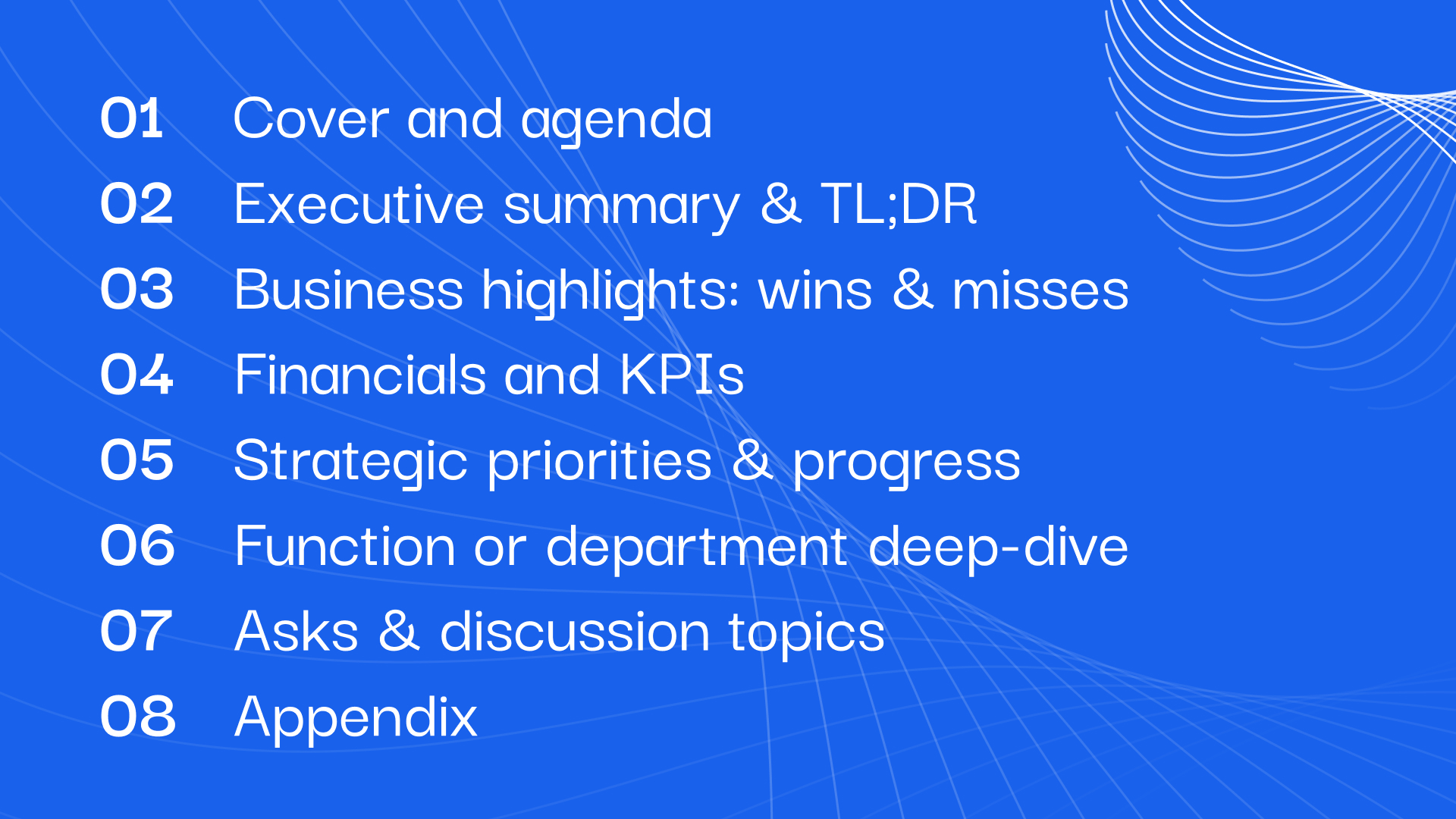
Every well-built board deck follows the same underlying structure. The company changes. The metrics change. The order and emphasis do not. Below is the eight-section framework that scales from Series A to public-company-adjacent.
- 1Cover and agendaTwo slides, sometimes one. Company name, reporting period, meeting number. Then a short agenda: what will be covered, what decisions are on the table, what asks the board will be walked through.
- 2Executive summary and TL;DRThe CEO's framing of the quarter. Three lines on how the business is doing, three on what changed since the last board, three on what needs decision or input today. Written last, read first.
- 3Business highlights: wins and missesTop three wins from the quarter. Top three misses. Same weight, same detail. This is the credibility check for the rest of the deck.
- 4Financials and KPIsRevenue, gross margin, burn, runway, plus the operating metrics that define your business. Same metrics every quarter. This is the trend line the board is here to see.
- 5Strategic priorities and progressWhat you said you would do last quarter, and what happened. Green, amber, red status against each. Then next quarter's priorities.
- 6Function or department deep-diveOne rotating slot: sales in Q1, product in Q2, GTM in Q3, hiring in Q4. Visibility into functions without ballooning the standing deck.
- 7Asks and discussion topicsWhat you need from the board today. Approvals, introductions, feedback on a specific decision. Return to the asks slide at the end of the meeting to confirm outcomes.
- 8AppendixCohort tables, detailed financial statements, org chart, past-quarter deep dives. Read by the directors who care, ignored by those who do not, essential either way.
What Goes on Each Slide: Section-by-Section
The eight-section framework tells you what belongs where. This section goes deeper on how each slide should actually be built - what to accomplish, what to avoid, and the one design decision that matters most.
Cover and agenda slides
The cover slide identifies the meeting. The agenda slide orients the reader on what will be covered and what decisions are on the table. Most people bury the agenda inside the executive summary or skip it entirely, which forces directors to scroll around looking for structure. The design decision that matters: list the specific asks on the agenda slide, not just topics. "Product roadmap Q3-Q4" is not an ask. "Approve raise timing for Q4" is.
Executive summary and TL;DR
The executive summary is the CEO's one-slide framing of the whole quarter. It should be readable in ninety seconds and give the board enough context to arrive at the meeting aligned on what matters. Most people write the executive summary first and let the deck expand from there, which is backwards - write it last so it reflects what the deck actually says. The design decision that matters: no more than nine lines of text, grouped into three sections (how we are doing, what changed, what we need).
Business highlights: wins and misses
The wins section shows directors what worked. The misses section shows them you know what did not. Most people give wins full slides and reduce misses to one bullet, which reads as spin and makes directors distrust everything else. The design decision that matters: give wins and misses equal visual weight. If wins get a full slide with metrics, misses get the same treatment.
Financials and KPIs
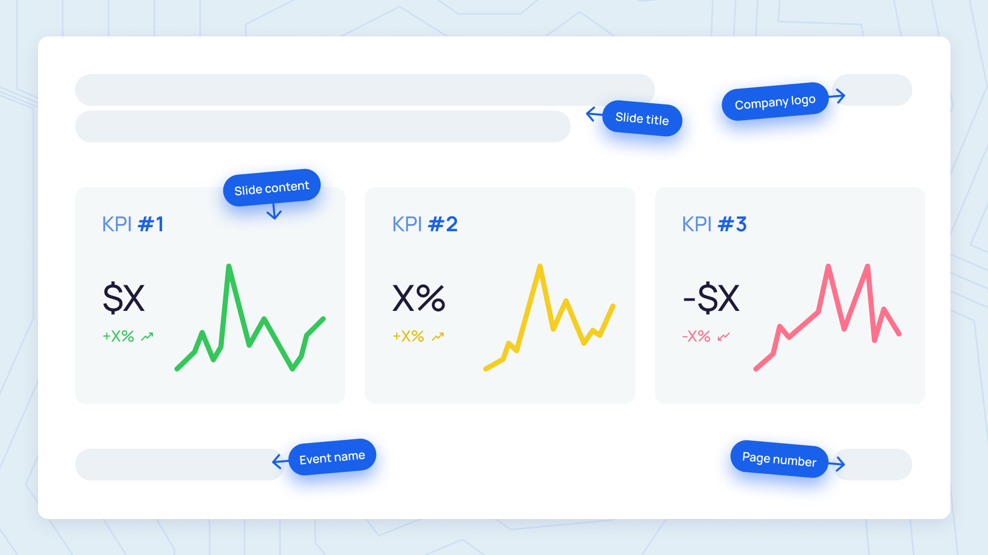
The financials slide shows the numbers that define the health of the business. The KPI dashboard shows the operating metrics that predict where those numbers are going. Most people show a different metric set each quarter, either because a new metric became relevant or because an old one embarrasses them. Both are mistakes. The design decision that matters: lock a KPI dashboard slide and use the identical layout every quarter. Directors will start scanning for the trend line the moment they see it. For the charts themselves, see our guide to data visualization for board decks.
Strategic priorities and progress
This is the accountability slide. What you committed to last quarter, and what actually happened. Most people restate priorities without honestly grading progress against them, which erodes the whole exercise. The design decision that matters: red/amber/green status per priority, using the same coding every quarter, with a one-sentence note on why any amber or red exists.
Function or department deep-dive
The rotating slot. Sales, product, engineering, hiring, GTM - whichever function needs board-level visibility this quarter. Most people either skip this entirely or try to cover every function every quarter, which crowds out real discussion. The design decision that matters: one function per quarter, treated as a mini-strategy conversation with its own asks.
A department's quarterly business review can feed this board update: bring forward the commitments, outcomes, and learnings that need board-level discussion.
Asks and discussion topics
The asks slide names what you need from the board at this meeting. Most people leave this slide vague or skip it entirely, which is why board meetings drift into general commentary. The design decision that matters: three asks maximum, phrased as specific decisions or introductions, not open-ended discussion prompts.
Appendix
The appendix holds everything a director might want but does not need in the main flow: detailed financials, cohort tables, historical performance, board composition, org chart. Most people either dump every raw table into the appendix or leave it out entirely. The first buries the signal, the second frustrates the directors who read carefully. The design decision that matters: label every appendix slide with its section number in the main deck ("Appendix A: financial detail supporting slide 12") so directors can navigate.
The Deck Works Twice: Pre-Read vs Live Meeting
Almost every guide to board decks talks about the meeting itself. Almost none talk about what happens before it. A board deck is a document twice: once as a pre-read that directors download and review on their own, and again as the live-meeting reference the exec team walks the room through. The two use cases have different design constraints, and the deck has to serve both.
As a pre-read, the deck is opened on a laptop, at 100 percent zoom, on a Sunday. The director is skimming. They want to spot the trend line, catch the miss, and note the questions they want to raise on Tuesday. This use case demands charts that read at reading distance, page numbers large enough to reference in follow-up emails, and appendix material that stands alone without narration.
As a live-meeting reference, the deck is projected onto a screen ten feet away from the furthest chair. This use case demands slide typography that reads across the room (14pt body minimum, 24pt headings, 36pt or higher for big numbers), one story per chart, and a consistent visual language across every slide so directors know where to look.
Most board decks are designed for the meeting and then handed to directors as a pre-read as an afterthought. The result is a deck that half-works twice. The deck that works properly is designed for both from the beginning, with the pre-read use case treated as the primary constraint.
How Board Decks Change by Stage
The eight-section framework holds across stages. What changes is depth, length, and emphasis. Below, the shape of a board deck at three stages of company maturity.
Series A board decks
Fifteen to twenty slides. The board is small (two to four directors, mostly the VCs who led each round plus the founder). Meetings often run monthly for the first two or three quarters, then settle into a quarterly cadence with lightweight monthly investor updates in between. The emphasis is on ARR growth, GTM motion converging on something repeatable, unit economics becoming legible, and the hires that will unlock the next phase. Directors at this stage are looking for signal that the company is finding its shape.
Series B board decks
Twenty to thirty slides. The board expands - most Series B boards add one or two independent directors, often operators from adjacent categories. Cadence firmly quarterly, monthly written updates between. The emphasis shifts to unit economics discipline (NRR, gross margin, CAC payback, burn multiple), scaling the GTM motion, org design at 100+ people, and the path to $50M or more in ARR. Directors at this stage want to see that the company is being operated with the discipline it will need to raise the next round.
Series C and beyond
Thirty to fifty or more slides, plus a substantial appendix. The board includes multiple independent directors, sometimes a strategic advisor or two, and sometimes an early public-market operator. Cadence quarterly with a heavier finance committee package and often a compensation committee meeting alongside. The emphasis moves toward path to profitability, cohort retention over multi-year windows, gross margin expansion, international or vertical expansion, and increasingly, exit readiness signals. Even if an exit is not imminent, directors want to see the company being run in a way that keeps every path open. Deck design at this stage matters more, not less, because the audience is larger, more diverse, and less involved in the day-to-day.
How Your Board Composition Changes What Belongs in the Deck
Two boards with the same slide count can want very different things inside those slides. Board composition changes what you should emphasize.
- 1VC-heavy boardsThey want financial detail and forward projections. Most VCs came up analyzing companies quantitatively; they will spend the meeting on cash, growth, and unit economics. Weight your deck toward the KPI dashboard, the burn analysis, and the pipeline forecast. Assume they will read the appendix.
- 2Independent-director-heavy boardsThey want strategic context and market framing. Independent directors, especially former operators, care about the how - how you are competing, how the team is holding up, how the customer relationship is evolving. Weight your deck toward market context, competitive positioning, and the operating narrative.
- 3Mixed boardsThey want both, which is why board decks grow with maturity. Main deck for the shared context, appendix depth for the VCs, strategic framing slides for the independents.
The other variable is what your directors did before. If your board has a former CFO of a public company, expect questions about disclosure hygiene and audit readiness. If it has a former head of product, expect deeper product roadmap questions. Design your deck for the board you actually have, not the generic one in a template.
The Common Mistakes That Waste Board Time
Every board deck mistake has the same root: designing for the maker instead of the reader. Six patterns show up again and again.
- 1Too longA forty-slide deck no one reads before the meeting is worse than a twenty-slide deck everyone reads. Fix: move anything that is not on the discussion path into the appendix.
- 2Different metrics every quarterThe trend line disappears the moment the metric set shifts. Fix: lock a KPI dashboard slide and rerun it every quarter, even if a metric goes sideways.
- 3No asks slideWithout one, the meeting becomes a status update and drifts. Fix: put "what we need from you today" at the top of the deck and return to it at the end.
- 4Spin over honestyWins get full slides, misses get one buried bullet. Directors notice, and they never trust the wins the same way again. Fix: name misses with the same clarity as wins, then explain the diagnosis.
- 5Illegible chartsFonts too small to read across the room, no annotation, no context line. Fix: single-sentence takeaway above every chart, axis labels large enough to project.
- 6Inconsistent branding across quartersFonts drift, chart styles change, colors do not match. This signals a lack of operating rhythm even when the numbers are fine. Fix: a locked design template, updated only when the brand itself changes.
The Design Decisions That Actually Matter
Design decisions on a board deck are not aesthetic. They are operational. Five choices do most of the work.
- 1A locked template used every quarterSame fonts, same chart styles, same slide layouts, same color coding. Directors should be able to open any slide from any quarter and know exactly where to look. It is the design system that lets you ship the deck in fifteen hours instead of forty by quarter eight.
- 2Chart legibility rulesOne data story per chart. Single-sentence takeaway above every chart. Axis labels large enough to project. No secondary y-axes unless truly necessary. If a chart needs the CEO's narration to make sense, redesign it.
- 3Typography that reads at 100 percent zoom and across a boardroomBody text at 14pt minimum. Headings at 24pt or larger. Big-number callouts at 36pt or above. Sans-serif for the deck body, with a serif only if the brand system requires it. Line height at 1.4 or better.
- 4Page numbersNon-negotiable, and large enough to read from across the room. Directors will say "let's jump to page 17" and the deck should let them do that instantly.
- 5Consistent color coding for statusGreen, amber, red, or the brand-native equivalent, used the same way on every status slide, every quarter. When the KPI dashboard turns amber in one row, directors should know exactly what that means without asking.
None of these are hard. What is hard is doing all five every quarter without slipping. That is the design system problem. It is why the board deck — and executive presentation design more broadly — is a systems project, not a design project.
Before the board deck ships, run the typography audit in our typography for business decks guide to check font consistency, hierarchy, chart labels, and cross-tool rendering.
How to Systematize So You Don't Rebuild Every Quarter
The first board deck takes 60 hours or more to build well. The 20th one should take 10 to 15 hours - because 80 percent of it is the same template with new numbers, and only the narrative slides need fresh thinking. If your deck still takes 40 hours or more in quarter eight, something in the system is broken.
Three moves fix most of it.
- Lock the template once and stop touching itEvery custom-designed slide in every deck is a slide someone will have to redo next quarter. The template exists so the standing content is drop-in. Fresh looks belong in the annual template refresh, not the quarterly deck.
- Wire the metrics slides to your BI toolThe KPI dashboard, the financial summary, the strategic priorities status - all of these can pull from a data source. If your team is manually re-typing numbers into slides every quarter, you are spending the wrong hours on the wrong work.
- Split recurring and narrative work80 percent of the deck is recurring. 20 percent is narrative - the executive summary, the wins/misses framing, the deep-dive slide, the asks. Batch the recurring work first, then spend the remaining time where the thinking actually happens.
Most companies get to a good template and then let it drift. A design partner earns its keep by holding the template steady across quarters, refreshing the deck in 24 hours, and freeing up the Chief of Staff or CEO's office to spend time on the narrative and the asks - the parts of the deck the board actually reads for.
Ship board decks quarter after quarter without rebuilding from scratch.
Slidecore is the monthly design subscription for growth-stage and enterprise teams. Locked template, refreshed content, 24-hour turnaround per deck. See how we work with Chiefs of Staff, CEOs, and CFOs who ship board decks every quarter.
Frequently Asked Questions
It depends on stage. Series A board decks typically run 15 to 20 slides in the main body, with a small appendix. Series B decks run 20 to 30 slides. Series C and beyond run 30 to 50 slides with a substantial appendix. Below 15 slides at any stage and you are usually skipping sections directors will ask about anyway.
A pitch deck is used to raise money from investors who do not know you yet. It sells vision, runs 10 to 15 slides, and is a one-off artifact. A board deck is used to update investors who already know you well, builds operational trust over time, runs 18 to 50 slides depending on stage, and is a recurring quarterly document.
Three to five days ahead of the meeting is standard. This gives directors enough time to review it over a weekend or evening and arrive at the meeting with questions in mind. Sending it less than 48 hours ahead frustrates directors and turns the meeting into a status update instead of a strategy discussion.
The first slide is the cover: company name, reporting period, meeting number or date. The second slide is the agenda, including the specific asks you need from the board. Directors should know what will be covered and what decisions are on the table before the deck opens up.
A Series A board deck runs 15 to 20 slides for a small VC-heavy board, emphasizing ARR growth, GTM shape, and hires. A Series C board deck runs 30 to 50 slides for a larger board including independent directors, emphasizing unit economics discipline, cohort retention over multi-year windows, path to profitability, and often exit readiness signals.
In practice, the Chief of Staff or the CEO's office owns assembly and design. The CEO owns the narrative - the executive summary, the wins/misses framing, and the asks. Function leaders own the numbers for their functions. This division scales; when the CEO tries to own the whole deck end-to-end, it becomes a bottleneck by Series B.
The first board deck often takes 60 or more hours because everything is being built from scratch. By the fifth or sixth quarterly deck, that should drop to 15 to 25 hours if the template is locked and the metrics slides feed from your BI tool. If it still takes 40 or more hours after eight quarters, something in your system needs redesigning.

Founder, Slidecore
Giorgi founded Slidecore to give teams a senior design partner for decks. His teams have designed 500+ decks for 100+ companies across SaaS, AI, fintech, and healthcare.
Meet the founder →Want decks like this for your team?
A design studio on subscription for every deck, report and keynote you ship.