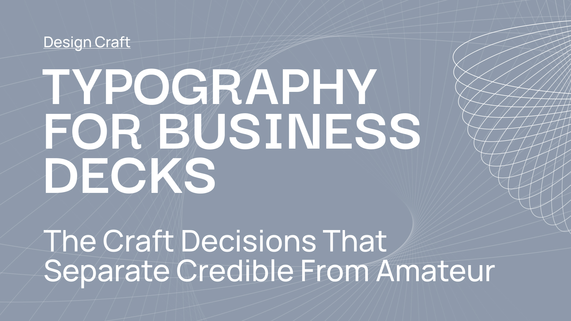
Typography for Business Decks: The Craft Decisions That Separate Credible Slides From Amateur Ones
A guide to the typography decisions that quietly make a deck feel considered - or quietly make it feel like it was built last night.
Typography is the thing most slide decks get wrong before anything else goes wrong.
A deck can have strong data, a clear argument, and a confident narrative, and still read as amateur if the type on the slide is working against it. The reverse is also true: a deck with modest content can land as credible if the typography is doing its job quietly in the background. Executives read decks constantly and judge craft subconsciously, even when they are not thinking about design.
This guide covers the typography decisions that actually matter for business decks. Font selection, type hierarchy, sizing, line length, spacing, and the specific craft choices that separate decks that read as considered from decks that read as hastily assembled. It is written for designers, product marketers, chiefs of staff, and anyone who ends up building business decks and wants to level up the one craft element that disproportionately shapes how the deck lands.
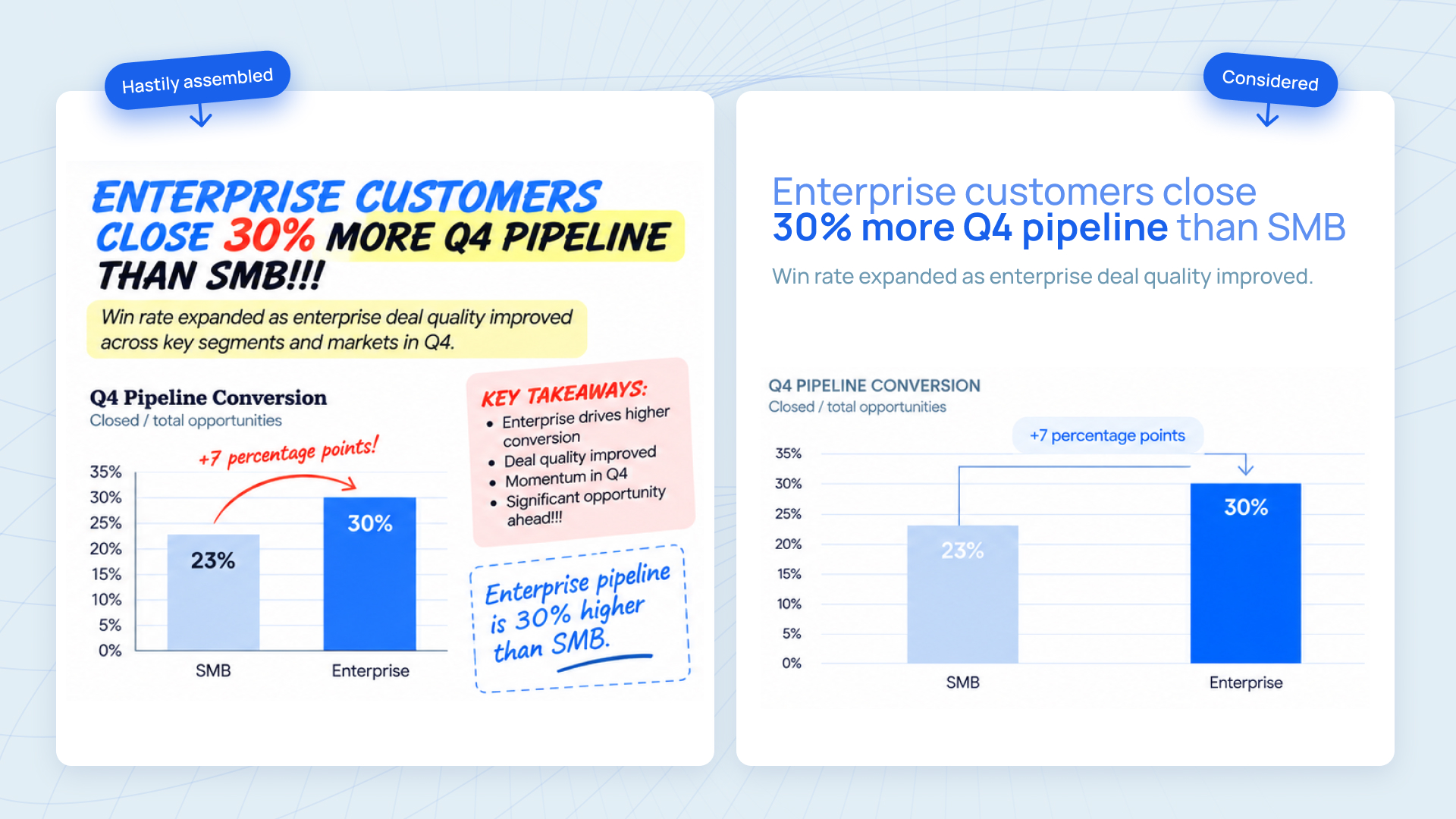
Why typography matters more in business decks than almost any other document type
Business decks are read differently than most documents. The reader has 2-5 seconds per slide on average before they move on. Hierarchy has to be instantly clear. The main point has to land before the detail. The eye has to know where to go without being told.
Typography is the system that makes this work. Font choice sets the tone (modern, traditional, technical, warm). Size and weight create hierarchy (what to read first, what to read next). Line length and spacing control reading comfort. Consistency across every slide signals that the deck came from a considered process, not an improvised one.
When typography fails in a business deck, it fails quietly. The reader does not consciously think 'this font is wrong.' They just feel like something is slightly off, and their trust in the content drops by a few percent. Multiplied across 20 slides, that cumulative trust loss is the difference between a deck that persuades and a deck that merely informs.
Font selection: how many, which ones, and the decisions that most teams get wrong
The one-family rule
Most business decks need exactly one type family. Not two sans-serifs that look similar. Not a serif for headings and a sans-serif for body. One family, used across every slide.
The reason: contrast within a family (regular, medium, bold, light; different sizes) is designed to work together. Contrast across families is designed to clash in some ways and harmonize in others, and most people building decks under deadline do not have the time or craft to pull off multi-family typography that actually works. The downside of trying is a deck that looks like it was built across multiple sessions with different aesthetic instincts.
Exceptions exist. A pairing of a strong display serif with a quiet sans-serif body can work beautifully in brand-forward decks (think category-launching keynotes, flagship investor pitches). But those decks are usually built by senior designers over multiple weeks, not by a product marketer the night before an executive review.
The default advice: pick one type family and use its weights to create all the hierarchy you need. Two-family pairings only when a specialist designer owns the deck.
Which font family to pick
For business decks, three characteristics make a type family a good default choice:
- Multiple weights available (at minimum: regular, medium, bold; ideally also light and semi-bold)
- Clear distinction between letterforms at small sizes (so chart labels at 10pt stay readable)
- Available in both your primary slide tool and in web/export formats
Common defaults that work well: Inter, Söhne, Söhne Mono, GT America, Suisse Int'l, Helvetica Neue, Aktiv Grotesk. These are all contemporary sans-serifs with the weight range and legibility business decks need.
Common choices that look modern but routinely cause problems: ultra-light display fonts used as body copy (hard to read at small sizes), condensed sans-serifs used across every slide (narrow letters compound awkwardly in dense slides), handwritten or display fonts used for emphasis (always read as unserious in business contexts).
The default advice: if you do not have a brand font specified, Inter is the hardest-to-get-wrong choice for a business deck. It is free, has deep weight range, is highly legible at every size, and works equally well in PowerPoint, Keynote, Google Slides, Figma Slides, and Canva.
Type hierarchy: the sizes and weights that actually matter
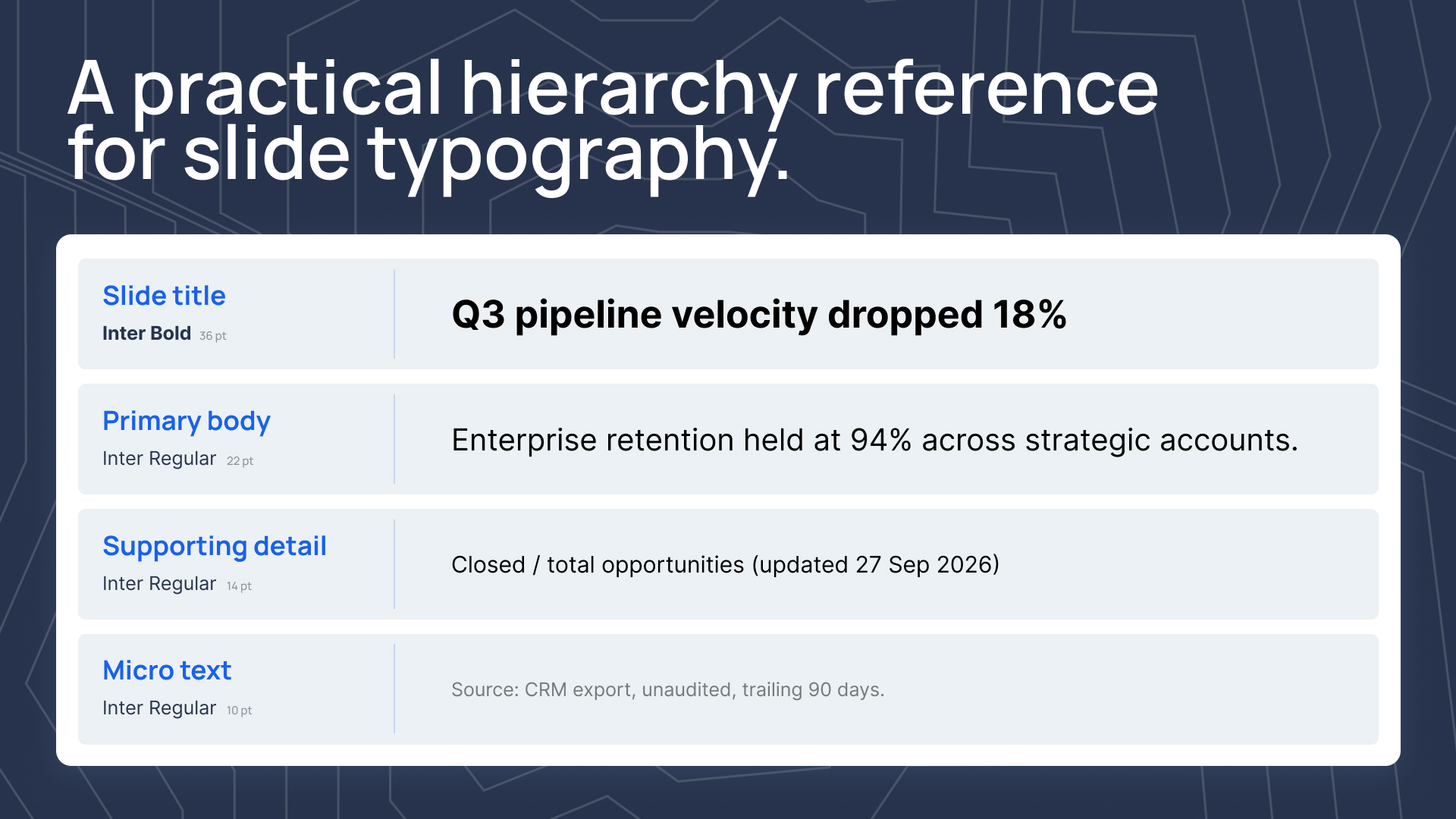
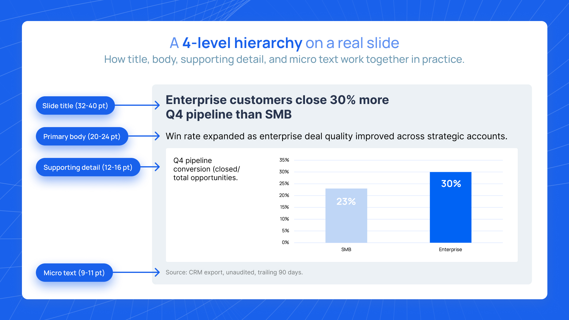
Business decks need three to four levels of type hierarchy, no more:
- Slide title (large, bold or heavy weight, consistent position across every slide)
- Primary body text (medium size, regular weight, used for the main content on the slide)
- Supporting detail or caption (smaller size, regular or lighter weight, used for context, source citations, chart annotations)
- Micro text (smallest size, used only for footnotes, source attributions, and page numbers)
The specific point sizes depend on the slide dimensions and the tool, but the ratios matter more than the absolute numbers. A good starting point for 16:9 slides at standard size:
- Slide title: 32-40pt
- Primary body: 18-24pt
- Supporting detail: 12-16pt
- Micro text: 9-11pt
The specific values flex based on the font and the content density of the slide. But the ratios (title roughly twice the body size; supporting detail roughly half; micro below that) should hold across the deck.
The mistake most decks make with hierarchy
Most amateur business decks use too many type sizes. A single slide ends up with the title at one size, a subtitle at another, body text at a third, bullet points at a fourth, a callout at a fifth, and a footnote at a sixth. Six sizes on one slide, none of them consistent with each other across slides.
The eye reads this as chaos. The reader cannot tell what matters most. Every slide feels like a different kind of document.
The fix is restrictive: no more than 4 type sizes across the entire deck. Pick the four, codify them in the design system, and use them without variation. If a slide needs more hierarchy than four sizes can give, the slide has too much on it and needs to be split in two.
Line length and reading comfort
Line length is one of the most underappreciated typography variables in business decks. Lines that are too long make reading tiring and reduce comprehension. Lines that are too short break the natural reading rhythm.
The research-backed rule for prose typography is 45-75 characters per line for optimal readability. Business decks are not prose, but the principle applies: body text that runs edge-to-edge across a 16:9 slide at full width is almost always too long. The reader loses their place from the end of one line to the beginning of the next.
Practical adjustments for business decks:
- Set a maximum content width for body text, typically 60-75% of slide width
- Use two-column layouts for text-dense slides rather than full-width paragraphs
- Break long bullet points into two shorter ones rather than wrapping to a third line
- Reserve full-width type for slide titles and single-sentence callouts, not body copy
Spacing: the invisible decisions that make typography feel professional
Three spacing variables shape how typography reads in a deck:
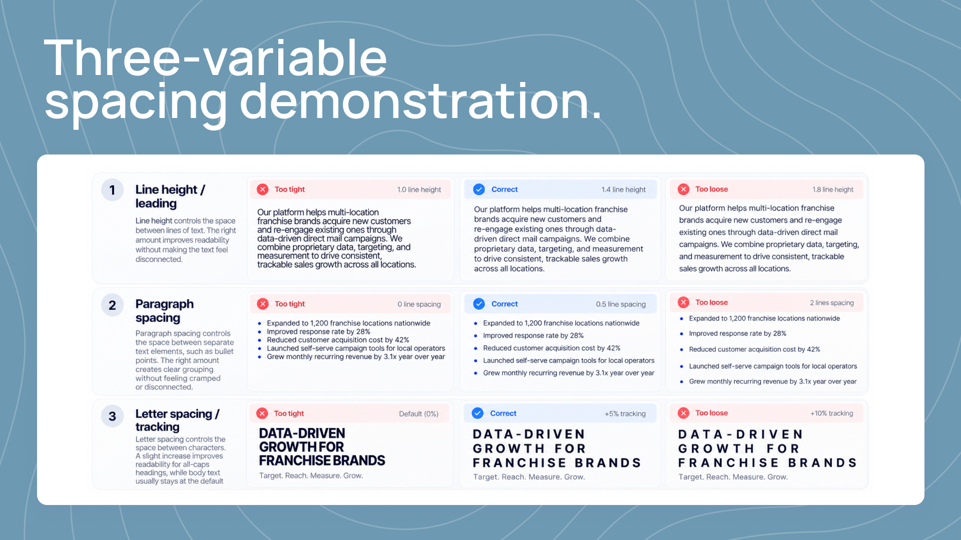
Line height (leading). The vertical space between lines of text. Too tight and the text feels cramped and hard to read. Too loose and the paragraph loses cohesion. The default for business deck body text should be roughly 1.3-1.5x the point size. Slide titles can go slightly tighter (1.1-1.25x); small micro text should go slightly looser (1.5-1.6x) to compensate for the smaller size.
Paragraph spacing. The gap between distinct chunks of text. Too tight and separate ideas blur together. Too loose and the slide feels sparse. For bullet points, a half-line of extra space after each bullet usually works. For paragraphs, a full line of extra space.
Letter spacing (tracking). The horizontal space between letters. Default tracking in modern fonts is usually correct and should not be adjusted. The one case where tracking matters: all-caps text (like slide titles in some brand systems) usually benefits from slightly looser tracking (5-10% extra) because capitals compound awkwardly at default spacing.
Spacing feels like a cosmetic detail. It is actually one of the most impactful typography decisions in a deck, because it is what makes typography feel confident versus cramped. Executives notice this subconsciously.
Typography in charts and data visualizations
Chart typography is where most business decks lose craft quickly. The temptation is to use the chart tool default settings (whatever font PowerPoint or Google Sheets picks, at whatever size they picked) and move on. The result is a chart that feels like it was dropped in from a different document.
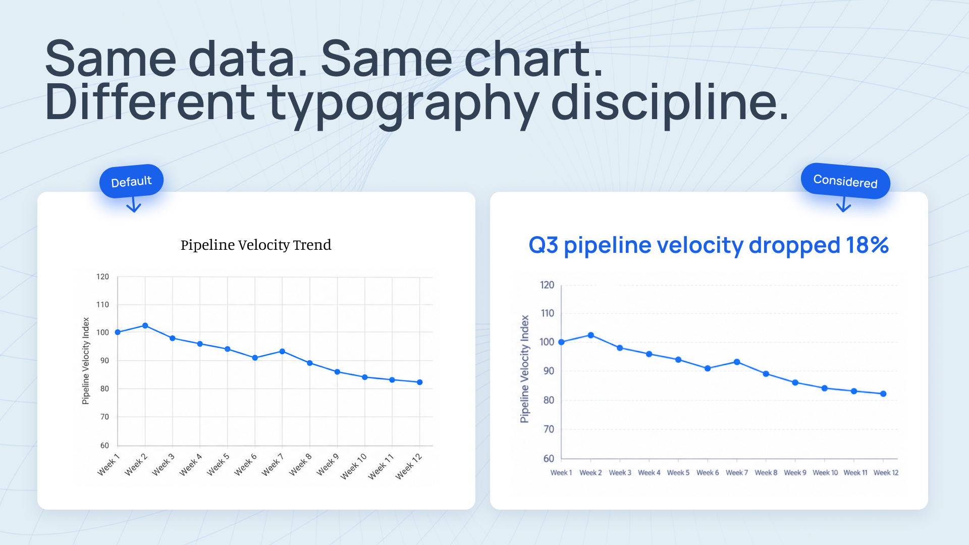
Three rules for chart typography:
- Use the same type family as the rest of the deck. If the deck is in Inter, the chart labels should be in Inter. Not Calibri (PowerPoint default) or Arial (Google Slides default).
- Chart titles get the primary body size and weight. Not a different size, not a different style. Treat chart titles like any body text in the deck.
- Axis labels and data labels get the supporting detail size. Not micro, which is too small to read in a chart context. Not primary body, which overwhelms the chart. Supporting detail (12-16pt) is the right level.
Headline-driven chart titles work especially well in business decks: the chart title tells the story ("Pipeline velocity dropped 18% in Q3") and the chart proves it. This structure requires that the title typography feels like a sentence, not a label. Our guide to data visualization for board decks goes deeper on this.
See data visualization for board decks for the chart-specific craft decisions that pair with these typography principles.
All-caps, italics, and emphasis: when to use them and when not to
Three forms of typographic emphasis routinely get overused in business decks:
All-caps. Works for short labels (section dividers, slide numbers, metadata). Does not work for body text (hard to read) or long titles (loses hierarchy clarity). If you use all-caps for slide titles, keep them to 2-4 words max.
Italics. Reserved for proper usage: book titles, foreign words, specific emphasis on a single word. Not for whole bullet points, not for every chart caption, not for most "soft" quotes. Italics used too freely stops reading as emphasis and starts reading as decoration.
Bold. Use within sentences to call attention to one specific phrase. Not to make entire paragraphs feel more important. If the whole slide is bold, nothing is bold.
Color-based emphasis. Red text to draw attention is a crutch that signals the slide could not create hierarchy through structure. Use color sparingly and consistently - typically only on data callouts or specific metric highlights, and only in the brand accent color, never red (unless the brand accent happens to be red).
Typography across tools: Keynote, PowerPoint, Google Slides, Figma Slides
A deck built in one tool rarely stays in that tool for its entire life. Someone needs to edit it in a different tool. Executives want it in Keynote because they present from Keynote. Finance needs the Google Slides version for distribution. The design team works in Figma Slides.
Typography that travels well across tools matters. Specific advice:
- Use fonts available across every tool. Inter, Helvetica Neue, and the system defaults (Calibri on Windows/PowerPoint; SF Pro on Mac/Keynote) all port cleanly. Custom brand fonts may not survive the trip.
- Build with the smallest-sized text in mind. If a chart label looks fine in PowerPoint but gets rendered 10% smaller when exported to Google Slides, it may fall below readable size. Design with headroom.
- Avoid heavy use of text effects (drop shadows, outlines, gradients on text). Most text effects do not survive tool-to-tool transfers cleanly and often introduce rendering artifacts.
- Test key slides in every target tool before finalizing. The whole deck does not need to be verified, but the title slide, the first content slide, and any chart-heavy slides should be checked for how they render in each tool the deck will live in.
For teams running multi-tool workflows (common at growth-stage marketing orgs where the CEO works in Keynote, marketing works in PowerPoint, and investor relations publishes in Google Slides), building typography that holds up across every tool is a design system decision, not a per-deck choice.
The typography audit: what to check before a deck ships
Before a business deck leaves the building, run a typography audit. 5 minutes, 7 checks:
- Is every slide using the same type family?
- Are there no more than 4 type sizes used across the deck?
- Do all slide titles sit in the same position, at the same size, in the same weight?
- Is body text consistent in size, weight, and spacing across similar slide types?
- Are chart titles, axis labels, and data labels in the same type family as the rest of the deck?
- Is emphasis (bold, italics, color) used restrained and consistently?
- Does the deck render correctly in the tool it will be presented in?
If any of these fail, fix them before ship. A deck that passes the typography audit will feel more considered than the same deck without it, and the reader will trust the content more without ever consciously knowing why.
For foundational slide design craft decisions beyond typography, see our slide design principles guide. For how typography shows up specifically in executive and board contexts, see executive presentation design.
When typography is more than you have time for
Typography is one of the design decisions that compounds over time. Teams shipping decks continuously benefit from having a persistent design system that encodes these decisions once and applies them to every deck going forward. Slidecore builds and maintains that system for growth-stage teams on monthly subscription - named senior designer per account, 24-hour turnaround per deck, native delivery in PowerPoint, Keynote, Google Slides, Figma Slides, and Canva. From $2,500 per month. See the pricing at slidecore.co/#pricing.
Frequently asked questions
You can, but most teams should not. Two-family pairings require more craft than most people building decks under deadline have time for, and the common failure mode is a deck that looks assembled from two different sources. If you want to pair, use a strong display serif with a quiet sans-serif body - and have a specialist designer own the pairing decision.
For 16:9 slides at standard size, 32-40pt for titles is the usable range. Larger (44-56pt) works for strong display moments like section dividers or keynote decks. Smaller than 32pt usually makes titles feel underweight relative to body content.
No more than four across the entire deck. Slide title, primary body, supporting detail, and micro text. More than four and the hierarchy stops reading as a system and starts reading as chaos.
Calibri is the PowerPoint default and reads to most sophisticated readers as 'nobody picked a font.' It is not actively bad - it is legible and functional - but it signals that the deck was built in PowerPoint with default settings. If you want the deck to feel considered, pick a specific font rather than defaulting to Calibri. Inter is a free alternative that reads more intentionally.
Only if the brand system specifies all-caps slide titles and only for short titles (2-4 words). All-caps longer titles become hard to parse and lose hierarchy clarity. If the brand does not specify, mixed-case (sentence case or title case) is the safer default.
Use fonts installed on both systems. Inter, Helvetica Neue, and Arial all exist cross-platform. Custom brand fonts may need to be embedded (PowerPoint has an 'embed fonts' option in save settings) or they will substitute when the deck opens on a system without the font installed. Testing in both tools before finalizing a deck is the only reliable way to catch this before it causes a problem in a real meeting.
Using too many different type sizes and weights on the same slide. The deck ends up with a title at one size, a subtitle at another, body text at a third, bullets at a fourth, callouts at a fifth, and a footnote at a sixth. The eye cannot tell what matters most. Restricting the deck to 3-4 total type sizes, used consistently across every slide, resolves the problem instantly.

Founder, Slidecore
Giorgi founded Slidecore to give teams a senior design partner for decks. His teams have designed 500+ decks for 100+ companies across SaaS, AI, fintech, and healthcare.
Meet the founder →Want decks like this for your team?
A design studio on subscription for every deck, report and keynote you ship.