Slide Design Principles: How to Build Slides That Read in Seconds
A slide is not a paragraph. It is a signal. Here are the eight slide design principles that make slides scannable in thirty seconds, the four craft areas where they get applied, and the mistakes that quietly kill otherwise good decks.
A slide is not a paragraph. It is a signal.
Nobody reads slides the way they read prose. They scan. They land on the top-left, sweep down and across, pattern-match against what they expected, and either engage or move on. Most of that happens in the first ten seconds. Whether a slide holds thirty seconds of attention or three is not determined by the slide's importance. It is determined by whether the scan resolved cleanly.
Slide design principles are the rules that make scans resolve cleanly. When they are applied, an audience gets your point in half the time they would otherwise. When they are not, the audience quietly re-routes their attention to their laptop screen or their phone, and the meeting drifts.
Most guides on slide design principles are written for creative designers building landing pages, brand systems, or standalone marketing assets. Slide design is different. The medium is different (the slide is smaller than a page and read faster). The audience is different (usually seated in a meeting they did not choose). The purpose is different (informing a decision, not selling a product). The rules that follow are specifically for slides shipped in a work context, not for design school.
This guide walks through the thirty-second test that separates great slides from adequate ones, why most slides fail the test, the eight principles that make slides scan cleanly, the four craft areas where those principles get applied (typography, layout, color, density), the common mistakes that break slide design, and how to build a slide design system that scales across the company.
Written for the CMO, Design Lead, Chief of Staff, or founder who owns the visual layer of the decks their company ships.

What Is the 30-Second Test?
The single most useful diagnostic for slide design is a test that takes half a minute per slide.
Show the slide to someone who has not seen the deck before. Give them thirty seconds. Then take the slide away and ask: What was the point of that slide? A well-designed slide gets a clean answer within thirty seconds. A poorly designed slide either produces a confused answer, a partial answer, or "I need more time to read it." All three are failures.
The test works because it approximates how executives, prospects, and board members actually consume slides. They do not sit and read; they glance, scan, and pattern-match. If your slide cannot survive that reality with a stranger, it will not survive it in the room with the audience whose time and attention are more constrained, not less.
Run the test on the slides you consider most important. If they fail, the deck is not ready yet. If they pass, the eight principles below have been at least partly applied. Every principle in this guide is essentially a way to make a slide pass the thirty-second test.
Why Most Slides Fail the Scan Test
Three failure modes account for almost every slide that flunks the thirty-second test.
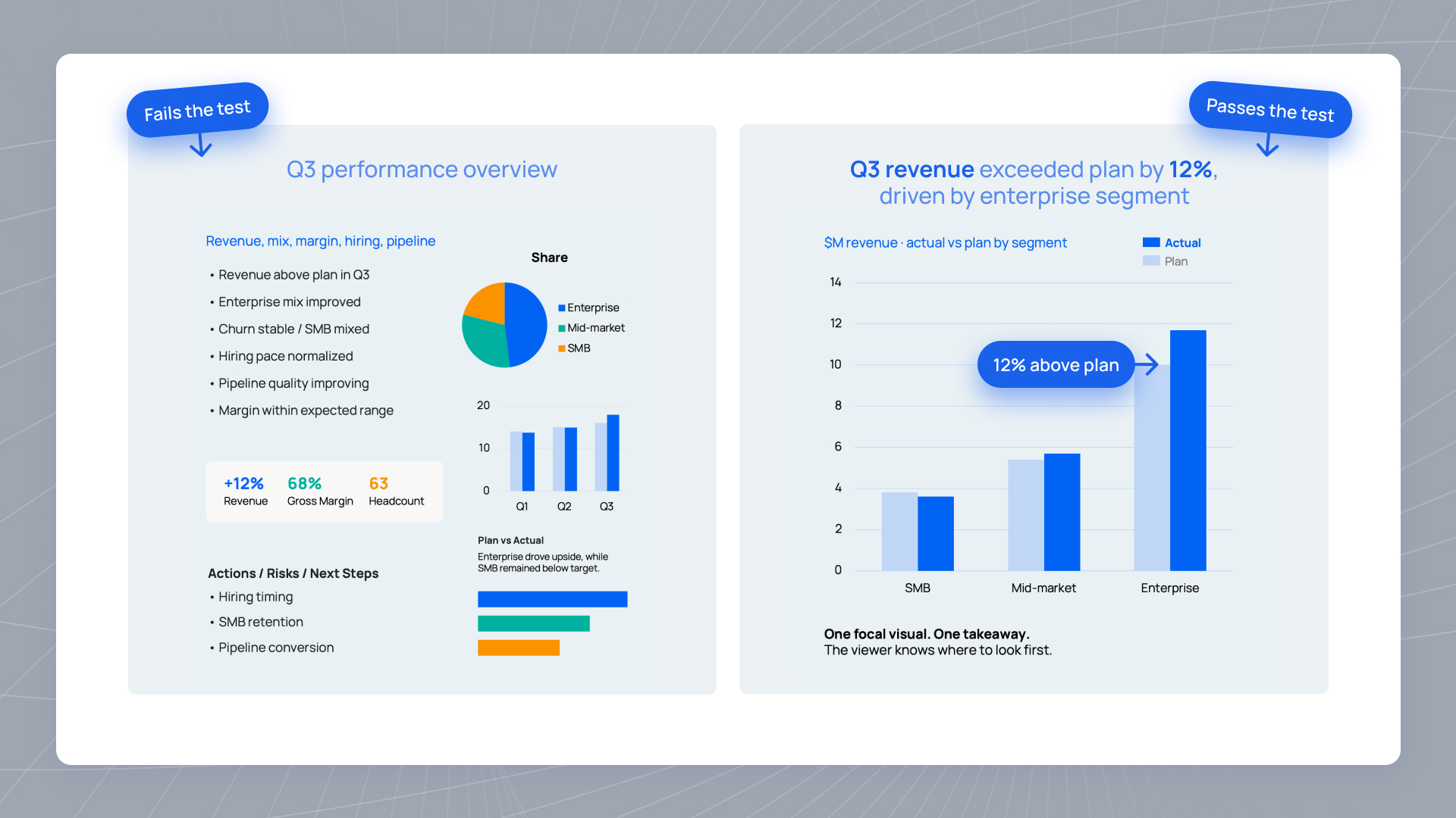
The slide title is a category label instead of a claim. "Q3 Financials" instead of "Q3 gross margin expanded to 62 percent." A category-label title forces the audience to read the slide body before they know what the slide is about. That is one full reading pass they did not have time for. If they only had thirty seconds, they now have zero seconds left for the actual content.
The slide has too many things happening. A chart plus three bullet points plus a call-out box plus a footer graphic. Each element is competing for the eye. Nothing wins. The audience's attention gets split across the slide instead of landing on the point. This is a density problem, not a formatting problem; the fix is to remove elements, not shrink them.
The visual hierarchy does not guide the scan. Every element is roughly the same size. Every color is roughly the same weight. The audience has no signal telling them where to look first, second, or third. In the absence of a hierarchy signal, they read left-to-right, top-to-bottom, like prose - which is the wrong reading pattern for a slide and adds ten seconds of processing before they can even start on the content.
All three failure modes are fixable. What they share is a common cause: the designer built the slide the way it would work as a paragraph, not the way it will work as a signal.
What Are the Eight Principles of Scan-First Slide Design?
These are the rules that separate a slide that reads cleanly from one that requires effort. They apply to board decks, sales decks, investor updates, keynotes, all-hands, and any other slide-based artifact where the audience will not have time to read.
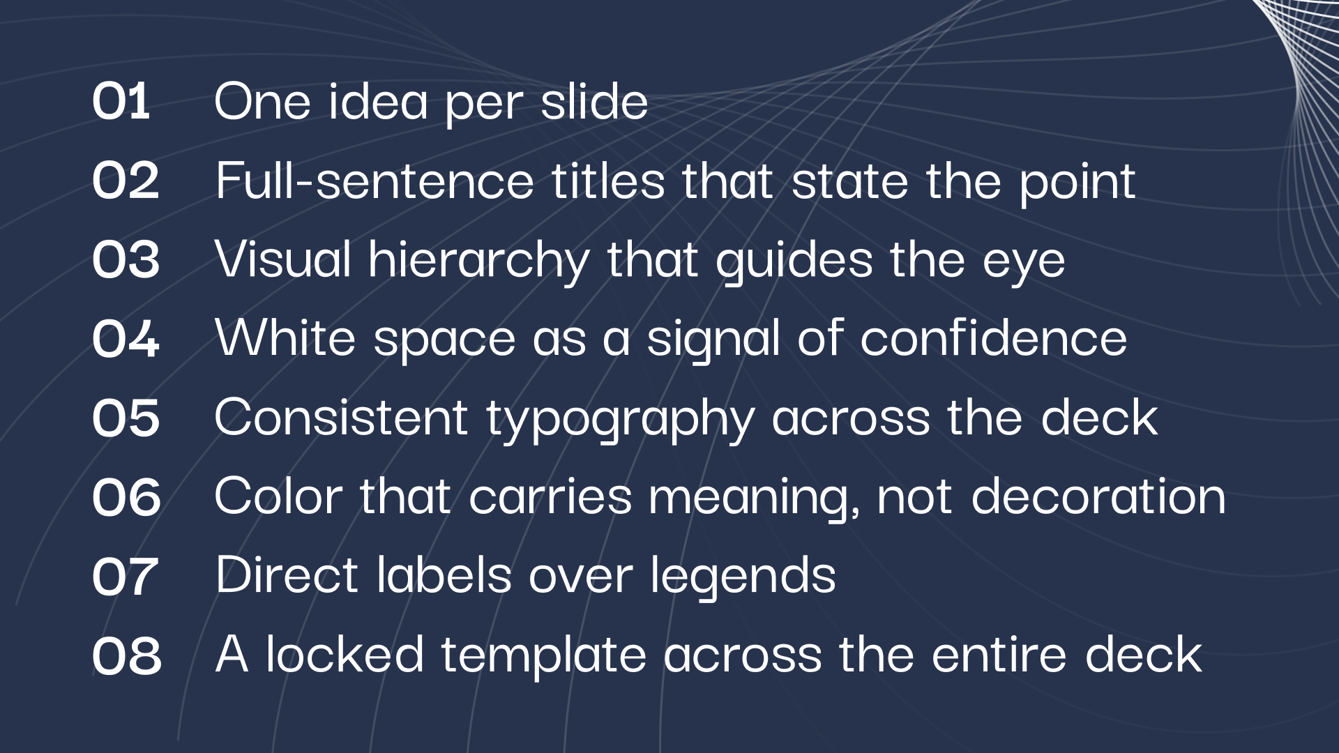
- 1One idea per slideThe single most important principle. If a slide has two ideas, it has to be two slides. Two ideas force the audience to split attention. Split attention almost always resolves into no attention. This principle alone would fix half the slides shipped by growth-stage companies.
- 2Full-sentence titles that state the pointNot "Q3 Revenue" but "Q3 revenue grew 18 percent, driven by enterprise expansion." The title is not the label; it is the takeaway. A reader who only sees the titles across the deck should get the argument in full without opening a single slide body.
- 3Visual hierarchy that guides the eyeThe first element the eye lands on should be the most important. Size, weight, and placement all encode priority. The title reads first because it is at the top and set in a distinctive size. The chart or visual reads second because it is the largest element. Everything else reads third or later. If the audience cannot tell what to look at first, the hierarchy has failed.
- 4White space as a signal of confidenceDense slides signal that the presenter is not sure what matters, so they included everything. Spacious slides signal that the presenter knows what matters and has left the rest out. This is the single most reliable proxy for design maturity in a deck. It is also the fastest fix; when in doubt, delete.
- 5Consistent typography across the deckOne font family (or two: display for headings, text for body). Same sizes used the same way on every slide. Titles at one size, body at another, captions at a third. Deviations distract the eye and burn cognitive load on visual reset instead of content processing.
- 6Color that carries meaning, not decorationEvery color on a slide should either carry information (status coding, category identity, emphasis on the story data) or be part of a consistent brand palette. Rainbow palettes where every element is a different color force the eye to decode the color scheme instead of reading the content.
- 7Direct labels over legendsA chart with a legend forces the reader to look up-and-across to decode which color means what. A chart with labels on the data itself (at the end of a line, next to a bar, on a data point) eliminates that step. Legends are for exploratory charts with many series. Slide charts almost never need them.
- 8A locked template across the entire deckSame layout skeleton. Same fonts. Same chart styles. Same color coding. Same footer treatment. Every slide follows the same grid. The template is not a design constraint; it is what allows the audience to stop processing visual language and focus on content. Slides that break the template within a deck are the design equivalent of a typo in a document.
These principles are the foundation. For how they apply when the audience is a board or an executive team, see our guide to pattern-matching for executive audiences.
Which Craft Areas Matter Most: Typography, Layout, Color, Density
The eight principles above are the rules. Below are the specific craft decisions that operationalize them, organized by the four areas where most slide design fails or succeeds: typography, layout, color, and density.
Typography
One or two font families total. A clean sans-serif for the body (Inter, Söhne, Helvetica, or the brand-native equivalent). An optional display serif or slab for headings if the brand system supports it, otherwise the same family in a heavier weight. Body text at 18pt minimum for slides meant to be projected, 24pt or higher for slides meant to be seen at the back of a boardroom. Line height at 1.4 or better. Avoid all-caps for body text; avoid decorative or condensed fonts entirely. Nancy Duarte's slide:ology is the canonical reference for slide typography and worth reading if this is a serious ownership area.
For a deeper guide to font selection, hierarchy, and spacing, see typography for business decks.
Layout
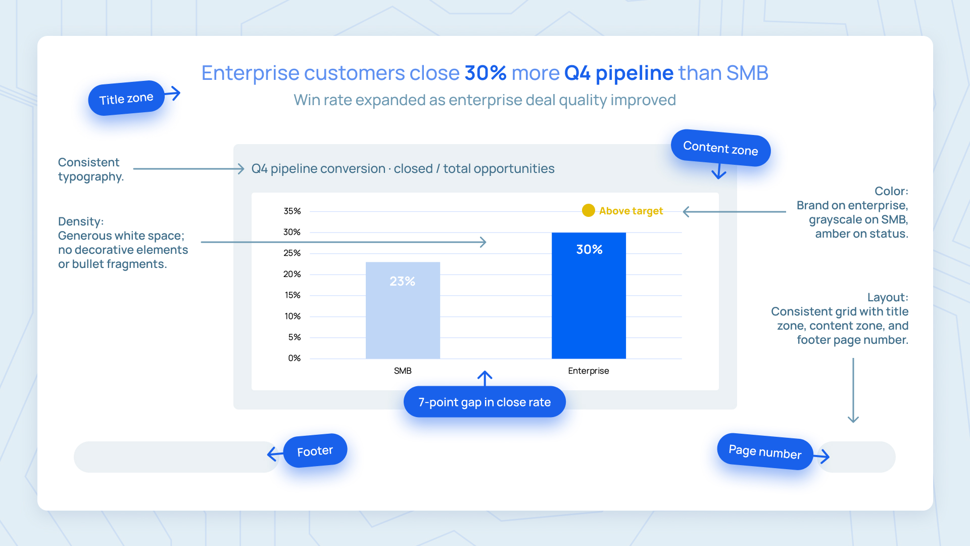
One layout grid used across the entire deck. Title zone at the top, content zone in the center, footer with page number and section marker at the bottom. Elements align to the grid rather than floating. Consistent margins (equal top/bottom, equal left/right). If the deck has multiple slide types (title, content, chart, section divider), each has its own layout template that follows the same underlying grid. Slides that break the grid look like mistakes even when they are intentional.
For a concrete example of layout grid discipline applied to a recurring deck, see our guide on how to build a board deck.
Color
A restrained palette. Two to four brand colors maximum, used the same way on every slide. One primary color for the brand and story-relevant elements. One or two secondary colors for supporting elements. A consistent status palette (green for on-plan, amber for slightly off, red for materially off) applied identically across every chart, table, and KPI card in the deck. Grayscale for context data (grayed-out lines on a chart, muted category labels). White space is not a color choice; treat it as a design element in its own right.
For a deeper dive on consistent status palettes in charts, see our guide to chart color coding for board decks.
Density
The signal-to-noise ratio decision. Every element on a slide should either carry information the audience needs or come off the slide. Bullet fragments that summarize what the presenter is about to say are noise. Icons that decorate but do not inform are noise. Backgrounds, borders, and gradient overlays that do not encode meaning are noise. A slide with too much noise reads as dense and unreadable regardless of how much typographic care went into the individual elements. The fix is subtraction, not shrinking.
The Common Mistakes That Kill Slide Design
Six patterns that break slide design at growth-stage companies. Every one is a version of designing slides as if they were documents.
- 1Bullet fragments instead of complete sentences"Increased revenue" is not a takeaway; it is a note to self. Fix: either the point belongs on the slide as a complete sentence, or it belongs in the presenter's notes. Bullet fragments are the design equivalent of speaking half-thoughts out loud.
- 2Fonts smaller than 14pt on slidesA common failure driven by trying to fit more content on a slide. If the content requires 12pt to fit, the content is too much. Fix: split the slide or remove content, never shrink the font.
- 3Every element in a different colorThe rainbow effect. Each element competes for attention. The eye cannot find a focal point. Fix: one brand color for the story, grayscale for context, and a consistent status palette for status. Everything else is decoration and should come off.
- 4Layouts that shift from slide to slideThe title in a different position on every slide. Different margins. Different footer treatments. The audience has to re-orient on every slide instead of settling into a rhythm. Fix: a locked template used across the entire deck, no exceptions.
- 5Decorative elements that carry no informationStock photos that do not illustrate the point. Icons that are decorative rather than semantic. Background gradients. Border boxes around slides. All noise. Fix: every element on a slide either encodes information or comes off.
- 6Category-label titles"Q3 Overview" instead of "Q3 revenue grew 18 percent." The most common failure and the easiest to fix. Every title becomes a full-sentence takeaway. The deck now reads at title-scan speed alone.
How Slide Design Compounds Into a System
Individual slides matter. The design system across every slide in a deck matters more. And the design system across every deck the company ships matters most of all.
A single well-designed slide is a fine accomplishment. A locked template applied consistently across a 25-slide board deck is a much bigger one, because the audience stops decoding visual language and starts absorbing content. A design system that scales the same template consistency across every deck the company ships all year - board decks, investor updates, sales decks, keynotes, all-hands - is the biggest of all, because it turns slide design from a per-deck project into an infrastructure asset that compounds credibility over time.
Building that system requires three moves.
- Own the master templateOne template, held by one function (usually design or marketing), used for every deck the company ships. Nobody else can edit the master. Individual decks are built by pulling from approved modular slides.
- Build a modular slide libraryStandard layouts for the recurring deck moves: KPI dashboard, financial summary, wins-and-misses, next steps, section divider. Every deck starts by pulling from the library rather than designing from a blank slide.
- Refresh the system annually, not per deckThe template stays stable across the year. It gets refreshed once, on the annual brand review, and holds the line for the other eleven months. Ad hoc redesigns per deck are how templates drift and design consistency collapses within two quarters.
If owning this system in-house feels like overhead, the honest math on subscription vs in-house design is worth reading before you decide who owns it.
Most companies underinvest in the slide design system because it feels like overhead. It is not. Slide-based artifacts are the highest-visibility internal and external surface the company owns, seen by investors, board members, employees, prospects, customers, and press. The design of that surface is a signal of operational maturity that compounds over time - and getting it right is worth building the system for.
Build a slide design system that scales across every deck you ship.
Slidecore designs board decks, sales decks, investor updates, and keynotes for growth-stage and enterprise teams on a monthly subscription. Locked template, modular slide library, consistent visual language across every deck.
Frequently Asked Questions
A simple diagnostic. Show a slide to someone who has not seen the deck before. Give them thirty seconds. Take the slide away. Ask them what the point of the slide was. A well-designed slide gets a clean answer within thirty seconds. A poorly designed slide produces confusion, partial answers, or "I need more time." Any of those three is a design failure and the slide needs to be reworked.
One idea per slide. If a slide has two ideas, it should be two slides. This principle alone would fix half the slides shipped by growth-stage companies. Every other principle (full-sentence titles, visual hierarchy, white space, consistent typography, meaningful color, direct labels, locked template) is easier to apply once the single-idea rule is holding.
Full sentences. Not "Q3 Revenue" but "Q3 revenue grew 18 percent, driven by enterprise expansion." Category-label titles force the audience to read the slide body to know what the slide is about, which defeats the pattern-matching cognitive shortcut audiences rely on. If a reader only sees the titles across a deck, they should get the argument in full.
As little as possible without losing the point. Body text should never be smaller than 14pt (18pt is better for projected slides). If a slide requires 12pt to fit, the slide has too much content and should be split. Bullet fragments almost always belong in the presenter notes, not on the slide itself. When in doubt, delete.
One or two font families total. A clean sans-serif for body (Inter, Söhne, Helvetica, or the brand-native equivalent). An optional display serif or slab for headings if the brand supports it. Consistent sizes used the same way on every slide. Avoid decorative fonts, condensed fonts, and all-caps body text.
Category-label titles. "Q3 Overview" instead of "Q3 revenue grew 18 percent." It is the most common failure across growth-stage decks, the easiest to fix, and the one that most directly defeats how slide-based audiences actually consume content. Fixing this single mistake would meaningfully improve half the decks shipped by growth-stage companies.
The eight principles hold across board decks, sales decks, investor updates, keynotes, and all-hands. What changes is the application. Board decks emphasize consistency across quarters and dense information architecture. Sales decks emphasize the champion-forwarding use case and slide-level standalone comprehension. Investor updates emphasize scannable metrics tables and design consistency across monthly sends. Keynotes emphasize visual pacing and one-idea-per-slide extremes. The principles are the same. The emphasis shifts.

Founder, Slidecore
Giorgi founded Slidecore to give teams a senior design partner for decks. His teams have designed 500+ decks for 100+ companies across SaaS, AI, fintech, and healthcare.
Meet the founder →Want decks like this for your team?
A design studio on subscription for every deck, report and keynote you ship.