Data Visualization for Board Decks: How to Design Charts That Get Scanned in Five Seconds
A board chart is a claim plus a proof. The takeaway line makes the claim; the chart provides the proof. Here's the framework, the five chart types that cover 90% of board data, and the design rules that make charts scannable in five seconds.
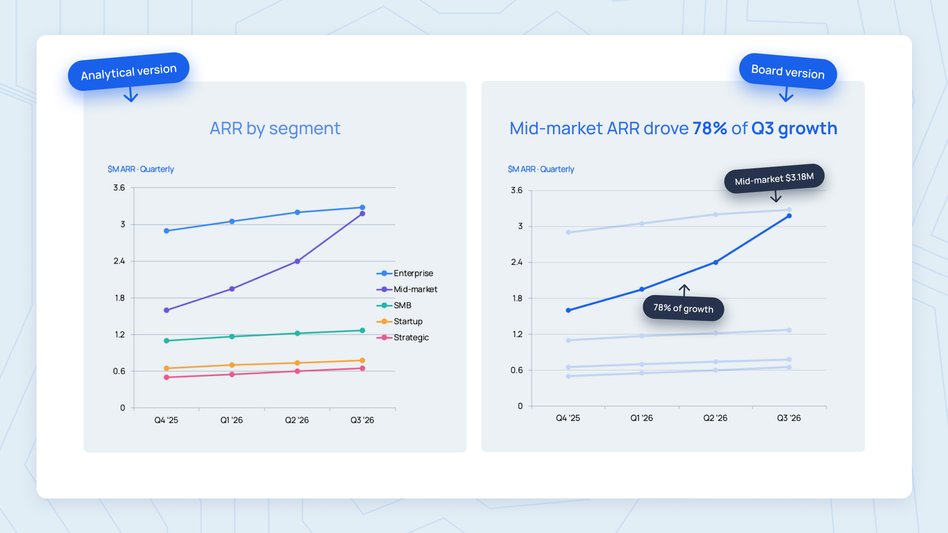
A board chart is a claim plus a proof. The takeaway line makes the claim. The chart provides the proof. If the audience has to reconstruct the claim from the chart, you have written the claim wrong.
That framing sounds simple. It changes everything. Most guides on data visualization for board decks treat charts as analytical tools: pick the right chart type, add legends, label the axes, let the data speak. That is how you build an analytical chart, a dashboard, a notebook figure meant to help someone explore data they have not seen before. It is not how you build a board chart.
Board directors do not explore charts. They verify them. They scan the takeaway line at the top of the slide, glance at the chart to check that the claim matches the visual, and move on. If the takeaway line is missing, or the chart does not obviously confirm the claim, the pattern breaks and the meeting slows down. Nobody wants that at 4pm on a Wednesday.
This guide walks through what makes board chart design different from generic data visualization, the claim-and-proof framework, the five chart types that cover 90 percent of board deck data, the design decisions that actually matter for executive audiences, the common mistakes that make board charts fail their audience, and how to build a chart design system that scales across every quarterly deck.
The same chart principles apply to quarterly business reviews: make the outcome visible, name what changed, and show only the data that supports the next decision.
Written for the Chief of Staff, CFO, CMO, or Design Lead who owns the visual layer of the recurring board deck cadence. If you are building the whole deck rather than just its charts, see our guide on how to build a board deck first.
Why Board Charts Are Different From Analytical Charts
Two categories of chart exist. Analytical charts are for exploration: a data analyst hunting for patterns, an operator investigating a metric anomaly, a product manager segmenting user behavior. The reader arrives without a specific hypothesis and uses the chart to form one.
Explanatory charts are for verification: the presenter has already found the pattern, already formed the conclusion, already picked the recommendation, and the chart exists to let the audience confirm the story is right. The reader arrives already knowing what the chart is meant to show and uses it to check the claim.
Board charts are extreme explanatory. By the time a chart appears on a board deck slide, the CEO, CFO, or Chief of Staff has already done the analysis, formed the conclusion, written the takeaway line, and decided this chart is the one that proves it. The board director's job is not to redo that work. It is to check that the takeaway is credible and move on to the discussion.
That is why almost every data visualization principle that applies to analytical charts either applies weakly to board charts or actively backfires. Multiple data series, complex axes, hover-to-reveal detail, exploratory color schemes - all of these help an analyst and hurt a director. The design constraints are different because the job is different. This is the same cognitive posture behind executive presentation design more broadly: the audience pattern-matches, so you design for verification, not exploration.
What Is the Claim-and-Proof Framework?
Every board chart is built in a specific order.
- 1Write the claim as a full sentenceNot "Q3 Revenue Growth" but "Q3 revenue grew 18 percent, driven by mid-market expansion." The claim is a complete sentence with a subject, a verb, and (where possible) a driver or reason. The claim is the point of the chart. Everything after this step is in service of the claim.
- 2Identify the single most direct proofThe chart type, the metric, the comparison, the time range - whatever combination most directly demonstrates the claim. If your claim is "mid-market expansion drove Q3 revenue growth", the most direct proof is a chart segmented by customer size showing the mid-market bar growing while others stay flat. Not a full pipeline breakdown, not a full P&L, not a stacked bar of everything - the single visual that lets the audience verify the claim in three seconds.
- 3Strip everything that does not carry the proofEvery axis, gridline, legend, label, color, and data series should either help the audience verify the claim or come off the chart.
- 4Place the claim above the chartFull sentence, top-left, distinctive typography. The claim reads first. The chart reads second, as evidence. This is the single most important design decision in board chart design, and the one most decks get wrong.
Step three's discipline comes from Cole Nussbaumer Knaflic's declutter framework: if an element does not carry information that supports the story, remove it. If you skip step one and jump straight to the chart, you build charts that look interesting but do not prove anything specific. That is analytical chart design applied to the wrong problem, and it is why so many board decks feel dense without being informative.
Which Chart Types Belong in a Board Deck?
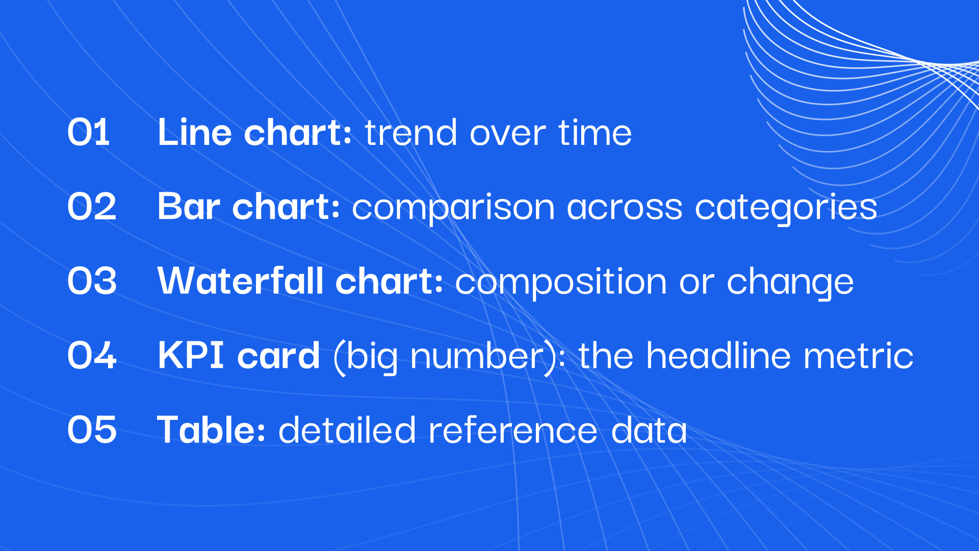
Board decks rely on a small number of chart types. The reason is not lack of imagination. It is that directors have seen these five patterns thousands of times, can decode them in seconds, and lose time on every unfamiliar chart type. Familiarity is not a limitation. It is a feature.
- 1Line chart: trend over timeThe single most common chart in a board deck. Revenue over the last eight quarters. ARR over 24 months. Burn over the last twelve months. Cash runway. Any metric that has moved through time and where the trajectory is the story. Design rules specific to line charts on board decks: solid line for actual, dashed line for plan, one to three lines maximum, colored labels on the last data point instead of a legend, y-axis usually starts at zero unless zero is far from the data range.
- 2Bar chart: comparison across categoriesThe second most common. Revenue by segment. Bookings by region. Headcount by function. Anything discrete that needs to be compared. Design rules: bars sorted by value (largest at top or left), single color unless a specific bar is called out, direct value labels on each bar, y-axis always starts at zero for bar charts (truncating misrepresents proportion). Horizontal bars are usually better than vertical for board decks because they read better on wide slides and support longer category labels.
- 3Waterfall chart: composition or changeUnderrated in board decks. Waterfall charts show how an aggregate number (like ARR at end of quarter) was built from starting point plus additions minus subtractions. Perfect for revenue bridges (starting ARR + new + expansion - churn = ending ARR), P&L walks, or hire plan reconciliations. Design rules: consistent colors for additions vs subtractions, running total labels on each segment, ending bar in a distinct color.
- 4KPI card (big number): the headline metricNot technically a chart, but the most efficient data visualization pattern in existence. One big number. Below it, the delta versus last period and versus plan, in small text with consistent color coding. Above it, the metric name in a clear label. Used for cash on hand, current ARR, current burn, headcount total - any single number where the value itself matters more than its history. Board decks that lead with a row of KPI cards on the executive summary slide land better than board decks that lead with a table.
- 5Table: detailed reference dataNot every board slide needs a chart. Detailed cohort retention, per-region breakdowns, hiring plan versus actual by function - these are tables, not charts, and they should be tables. Design rules for board tables: right-aligned numbers, monospace or tabular figures for the numbers, subtle row shading for readability, delta columns colored consistently (green/amber/red), maximum eight rows and six columns before the table needs to move to the appendix.
The KPI card pattern is worth calling out separately: the same big-number-plus-delta layout is the core visual of a good monthly investor update, so the design work you do here compounds across every recurring artifact your company ships.
The Chart Design Decisions That Actually Matter for Board Audiences
Seven decisions carry disproportionate weight in board chart design.
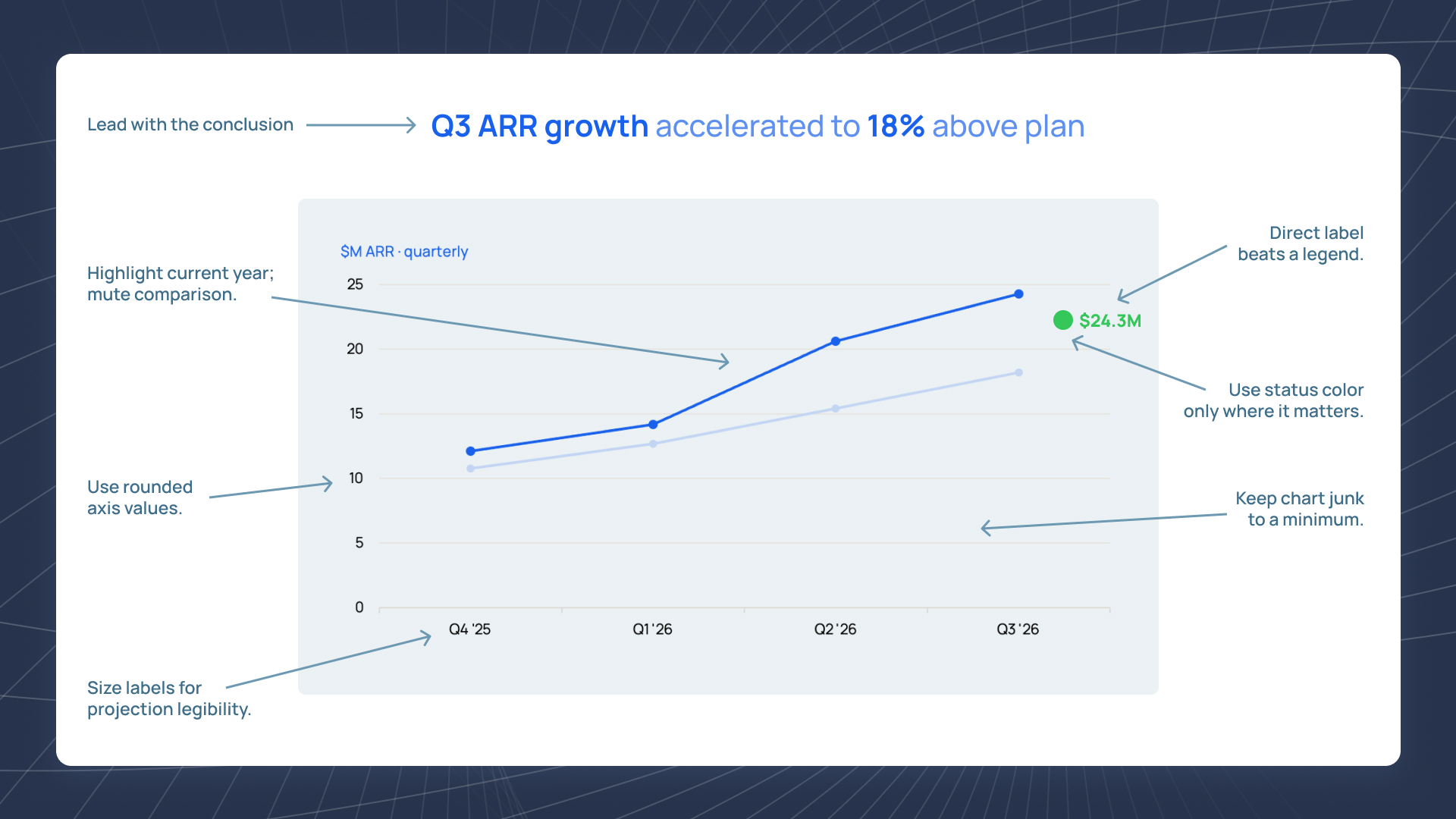
- 1Takeaway line above every chartFull sentence. Distinctive typography. Above the chart, not below. This is the single most important design rule in board data visualization and the one most decks get wrong. If a director reads only the takeaway lines across the deck, they should get the argument in full without needing to interpret any chart.
- 2Gray out everything that is not the storyIf the claim is about mid-market growth, the mid-market bar is colored and the rest are gray. If the claim is about the Q3-Q4 acceleration, the Q3 and Q4 points are colored and the rest of the line is gray. Directors' eyes go to what stands out; grayed-out data still provides context without competing for attention.
- 3Direct labels instead of legendsA legend forces the director to look up-and-across to decode which color means what. Direct labels (on the line, at the end of the bar, next to the data point) eliminate that step. Legends are for analytical charts with many series. Board charts almost never need them.
- 4Round to what matters$2.4M, not $2,437,891. 18 percent, not 17.83 percent. Extra precision does not add credibility; it forces the director's eye to parse detail that does not change the decision. Round to the precision the audience can act on, no further.
- 5Consistent color coding for statusGreen for on or above plan. Amber for slightly off. Red for materially off. Same coding on every chart, every table, every KPI card, every quarter. When a director sees an amber cell on the fifth slide, they should know exactly what it means without checking a legend.
- 6Chart junk removed by defaultNo 3D effects. No drop shadows. No background fills or borders that box in the chart for no reason. Gridlines faint or absent. Axis lines minimal. Data labels only where they carry information. Every element that is not carrying information adds noise, and noise is what makes a board chart feel dense instead of clean.
- 7Legibility from ten feet away AND at 100 percent zoomSame rule as every other design decision in the board deck. Axis labels at 14pt minimum. Line weights heavy enough to survive projection. Data labels large enough to read on a director's phone during a Sunday pre-read. If the chart falls apart at either distance, it is not a board chart yet.
These seven decisions are a subset of the wider craft. Our guide to slide design principles covers the eight rules that make any slide readable in thirty seconds - typography, layout, color, and density included.
For chart titles, axis labels, and data labels that match the rest of your deck, see typography for business decks.
The Common Mistakes That Kill Board Charts
Six patterns that make a board chart fail its audience. Every one is a version of designing an analytical chart when the audience needs an explanatory one.
- 1Category-label titles above charts"Q3 Revenue" instead of "Q3 revenue grew 18 percent, driven by mid-market expansion." This is the most common failure in board chart design and the easiest to fix. Every chart gets a full-sentence claim above it. No exceptions.
- 2Dual-y-axis chartsTwo metrics on the same chart with different y-axes on the left and right. The director now has to decode which line corresponds to which axis, which almost always fails. Fix: two side-by-side charts, each with its own single axis and its own single claim.
- 3Rainbow color schemes with no meaningEvery series is a different bright color. The color is decorative, not semantic. Fix: color carries meaning (status, category the claim is about) or the chart is monochrome with only the story-relevant data in color.
- 4Truncated y-axes on bar chartsY-axis starts at 92 instead of 0 to make a small change look big. Any director who has read a deck before spots this immediately and loses trust in the entire deck. Fix: bar charts always start at zero. If the change is genuinely small, either use a line chart (where truncation is acceptable and standard) or reconsider whether the change is worth a chart.
- 5Charts with no source or period labelBoard directors want to know where the numbers came from and what time period they cover. Missing this signals that the presenter has not thought about verification. Fix: small caption below every chart with the data source and period.
- 6The chart is the wrong chart typeA pie chart with eleven segments. A bubble chart when a bar chart would work. A stacked area chart for compositions that change over time (nearly always unreadable). Fix: use the five chart types listed above unless there is a specific reason not to.
Design board charts once, ship them every quarter.
Slidecore designs board decks, executive presentations, investor updates, and their underlying chart libraries for growth-stage and enterprise teams on a monthly subscription. Locked template, 24-hour turnaround, chart design that holds up quarter after quarter.
How Board Chart Design Should Match the Deck's Design System
Individual charts matter. The design system across all the charts in a board deck matters more.
Directors read board decks quarterly. Across a year, they see the same charts four times: revenue trend, gross margin bridge, cash and runway, KPI dashboard, cohort retention. If those charts look meaningfully different from one quarter to the next, the director has to relearn each chart every time. Cognitive load spent on decoding is cognitive load not spent on the actual discussion.
Consistency across quarters is not aesthetic. It is functional. Same color palette. Same chart types for the same metrics. Same axis conventions. Same font sizes for data labels. Same treatment for actual vs plan. The board deck template locks all of this in one place, and the chart design system is a subset of that template.
Consistency across charts within a deck matters too. If revenue is shown as a line chart on slide 8 and bookings is shown as a stacked bar on slide 9, and burn is shown as a waterfall on slide 10, directors are relearning the visual language every slide. Prefer to lock the chart type to the metric and use it every time.
How to Systematize Board Chart Design Across Quarters
Board charts are not one-off design projects. They are a recurring artifact that ships four times a year with roughly the same structure. That means the design system for them is a solvable problem, if you build it once.
- 1Lock the chart libraryEvery recurring chart in the board deck (revenue trend, gross margin bridge, cash and runway, KPI dashboard, cohort retention, hiring plan versus actual) gets a template: chart type, color coding, axis convention, data label style, source caption format. The template locks the design once and holds the line for every future quarter.
- 2Feed the charts from a data source, not a manual copy-pasteIf someone is retyping numbers from a BI tool into slide charts every quarter, the design system is fragile. Every retype is a source of error and a source of drift. Wire the recurring charts to pull from your data warehouse or BI tool where possible; even a semi-manual export-and-refresh process is more reliable than typing.
- 3Review the claim above every chart, not just the chart itselfThe most common quality control failure in board decks is charts that look fine but have takeaway lines that no longer match the underlying data. Every quarter, someone (usually the Chief of Staff) needs to read the claim above each chart and check that it is still true given the current numbers. The design system holds; the wording is what drifts.
If building this system in-house feels like overhead, the honest math on subscription vs in-house design is worth reading before you decide who owns it. A locked chart library, wired to a data source, reviewed for claim accuracy every quarter, is the design system that makes board chart design a solved problem rather than a recurring emergency. Most companies do not build this system because it feels like overhead. It is not. Board charts are the single most-scrutinized part of the deck. Getting them right is worth building the system for.
Frequently Asked Questions
A full-sentence takeaway line above every chart. Not the metric name ("Q3 Revenue") but the claim being made ("Q3 revenue grew 18 percent, driven by mid-market expansion"). Directors scan the takeaway line, glance at the chart to verify the claim, and move on. Without the takeaway line, the director has to reconstruct the claim from the chart itself, which slows down the meeting and increases the chance of misinterpretation.
Ideally five or fewer: line charts for trends over time, bar charts for category comparison, waterfall charts for composition or change, KPI cards for headline metrics, and tables for detailed reference data. These five cover 90 percent of what board decks need to show. Directors decode them in seconds because they have seen them thousands of times. Uncommon chart types (radar, chord, bubble, treemap) force directors to relearn the visual language and rarely pay back that cost.
Almost never. A legend forces the reader to look up-and-across to decode which color means what. Direct labels on the chart (on the line at its endpoint, next to the bar, on the data point) are always better for board audiences. Legends are appropriate when a chart has many series (five or more) that cannot be labeled inline, but that many series on a board chart usually means the chart is doing too much and should be split.
Yes. Truncating the y-axis on a bar chart misrepresents proportion (a bar that looks twice as tall as another actually represents a smaller ratio in the data). Any director who has read decks before will spot this immediately and lose trust in the whole presentation. Line charts have more flexibility because the eye reads slope more than absolute height, but bar charts should always start at zero.
Whatever the brand palette dictates for the main color, plus a consistent color coding for status: green for on or above plan, amber for slightly off, red for materially off. Gray out data that is context but not the story. Avoid rainbow palettes where every series is a different bright color; they are decorative, not semantic, and they make the eye work harder. Same color coding across every chart, every quarter, to build a pattern the board can rely on.
For most business metrics (revenue, burn, headcount), uncertainty is not shown on the chart itself; it is discussed in the presenter's notes or in the appendix. For forecasts and scenarios, show a range as a shaded band around the central line, with the shading kept subtle so it does not compete with the main data. Explicit error bars are rare on board decks because they add visual complexity for information most audiences interpret imprecisely anyway.
Depends on the recurrence and precision needed. For one-off charts with a specific creative treatment (annotations, callouts, custom styling), design tools like Figma or Illustrator give the most control. For recurring board deck charts, connecting to a BI tool (Tableau, Looker, Metabase) and exporting styled screenshots is more reliable because the numbers stay current automatically. PowerPoint's native charts sit awkwardly in between: fine for a first draft, prone to drift in the long run.

Founder, Slidecore
Giorgi founded Slidecore to give teams a senior design partner for decks. His teams have designed 500+ decks for 100+ companies across SaaS, AI, fintech, and healthcare.
Meet the founder →Want decks like this for your team?
A design studio on subscription for every deck, report and keynote you ship.